11 Dose-Response curves
We are surrounded by synthetic and natural substances that have both positive and negative effects upon humans, other animals, and the environment. It is difficult to estimate effects of a substance without testing it on living organisms. Chemical and physical properties of a substance can tell us about the molecules themselves, but living organisms may react in unpredictable ways. Therefore, we use biological assay to estimate effects. It means the design of bioassay experiments and the modelling of the response as a function of the dose is crucial for the classification of chemical compounds. In order to understand the principles of bioassay it is imperative to link results with the real world exposure to chemicals. In this chapter, chemicals used to illustrate bioassay are pesticides, but the principles are the same whatever the chemical.
Finney 1976 wrote: “As a branch of applied statistics, biological assay appears to have a somewhat specialized appeal. Although a few statisticians have worked in it intensively, to the majority it appears as a topic that can be neglected, either because of its difficulties or because it is trivial……. I am convinced that many features of bioassay are out-standingly good for concentrating the mind on important parts of biometric practice and statistical inference.”
In biology there are four general curves that describe many biological phenomena. Two of them, the rectangular hyperbola (of which Michaelis-Menten is a notable example) and sigmoid curves have either one or two asymptotes; that is, they have upper and/or lower limits as the independent variable approaches very small or very large values.
In most text books, non-linear regression is not very well explained although it is easy for practitioners to implement. The difference between linear and non-linear regression can often be boiled down to the very fact: linear regression can be solved analytically by least square analysis, whereas the nonlinear regression cannot.
Before fitting a nonlinear regression model, one has to do some guesstimates about the initial regression parameters before fitting. In some cases a nonlinear relationship can be converted to a linear one. The most common one is the exponential curve (Figure 1 that turns into a linear relationship when taking the logarithm of the y. For the rectangular hyperbola it is usually with no lower limit and then it can also be linearize by manipulating as in ezymeology and biochemistry.The rectangular hyperbola is in other disciplines called the Michaelis Menten model.
This chapter will be devoted to the use of the add-on package `drc? and will illustrate some of the facilities built in the package so far.
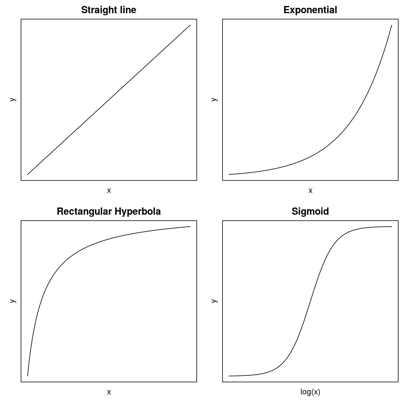
Figure 11.1: Common regressions models in the biological sciences.
For the sigmoid curves, which can take several forms, we have to use nonlinear regression. One of the most common curves is the symmetric log-logistic model:
\[y = c+\frac{d-c}{1+exp(b(log(x)-log(ED50)))} .\]
y is the response, c denotes the lower limit of the response when the dose x approaches infinity; d is the upper limit when the dose x approaches 0. b denotes the slope around the point of inflection, which is the \(ED_{50}\), i.e. the dose required to reduce the response half-way between the upper and lower limit.
Guessing the parameters of a sigmoid curve can, for the less experienced person, be tiresome and frustrating. This has now been overcome by the development of a package named drc, which was developed at the University of Copenhagen. The purpose of the drc package was to ease the analysis of dose-response curves from greenhouse and field experiments in Weed and Pesticide Science courses and to assess the selectivity of herbicides and efficacy of pesticides. Similar dose-response curves are commonly used in ecotoxicology and general toxicology, and the drc package is used in various other disciplines.
Gradually, drc has been extended with numerous nonlinear curves commonly used in the life sciences and elsewhere. The engine of drc is the drm(y~x, fct=...) function with self-starter that automatically calculates initial parameters. The fct=argument identifies the particular dose-response curve to be used. An overview of the various functions available can be accessed, after loading the drc package, by typing ?getMeanFunctions().
11.1 One Dose-Response Curve
Let us look at how to fit a dose-response curve using a training data set in the drc package.
library(drc)Before curve fitting, it is important to get an idea of how the data look. Below we create a plot with the x variable both on original scale and on log scale.
head(ryegrass,3) ## rootl conc
## 1 7.580000 0
## 2 8.000000 0
## 3 8.328571 0op <- par(mfrow = c(1, 2), mar=c(3.2,3.2,2,.5), mgp=c(2,.7,0)) #make two plots in two columns
plot(rootl ~ conc, data = ryegrass, main="Original Dose Scale")
plot(rootl ~ log(conc+.1), data = ryegrass, main="Logarithmic Dose Scale")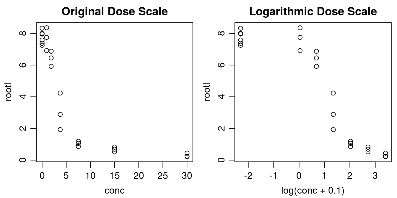
Figure 11.2: There are two ways of plotting dose-response data, the default in the drc package is to use a logarithmic scale for x. Note with the logarithmic dose scale the untreated control, 0, is not defined. That is why we add 0.1 to the concentration before taking the logarithm.
Below we fit a four-parameter log-logistic model with user-defined parameter names. The default names of the parameters (b, c, d, and e) included in the drm() function might not make sense to many weed scientists, but the names=c() argument can be used to facilitate sharing output with less seasoned drc users. The four parameter log-logistic curve has an upper limit, d, lower limit, c, the \(ED_{50}\) is denoted e, and finally the slope, b, around the \(ED_{50}\).
ryegrass.m1 <- drm(rootl ~ conc, data = ryegrass,
                   fct = LL.4(names = c("Slope", "Lower Limit", "Upper Limit", "ED50")))
summary(ryegrass.m1)
##
## Model fitted: Log-logistic (ED50 as parameter) (4 parms)
##
## Parameter estimates:
##
## Estimate Std. Error t-value p-value
## Slope:(Intercept) 2.98222 0.46506 6.4125 2.960e-06 ***
## Lower Limit:(Intercept) 0.48141 0.21219 2.2688 0.03451 *
## Upper Limit:(Intercept) 7.79296 0.18857 41.3272 < 2.2e-16 ***
## ED50:(Intercept) 3.05795 0.18573 16.4644 4.268e-13 ***
## ---
## Signif. codes: 0 '***' 0.001 '**' 0.01 '*' 0.05 '.' 0.1 ' ' 1
##
## Residual standard error:
##
## 0.5196256 (20 degrees of freedom)The summary of the curve fitting shows the estimates of each of the four parameters and their standard errors. The p-values tell us if the parameters are different from zero. In this instance all four parameters are significantly different from zero and as seen on the graph the log-logistic curve seems to fit well to data.
op <- par(mfrow = c(1, 2), mar=c(3.2,3.2,.5,.5), mgp=c(2,.7,0))
plot(ryegrass.m1, broken=TRUE, bty="l",
     xlab="Concentration of Ferulic Acid", ylab="Length of Roots")
plot(ryegrass.m1, broken=TRUE, bty="l",
     xlab="Concentration of Ferulic Acid", ylab="Length of Roots",type="all")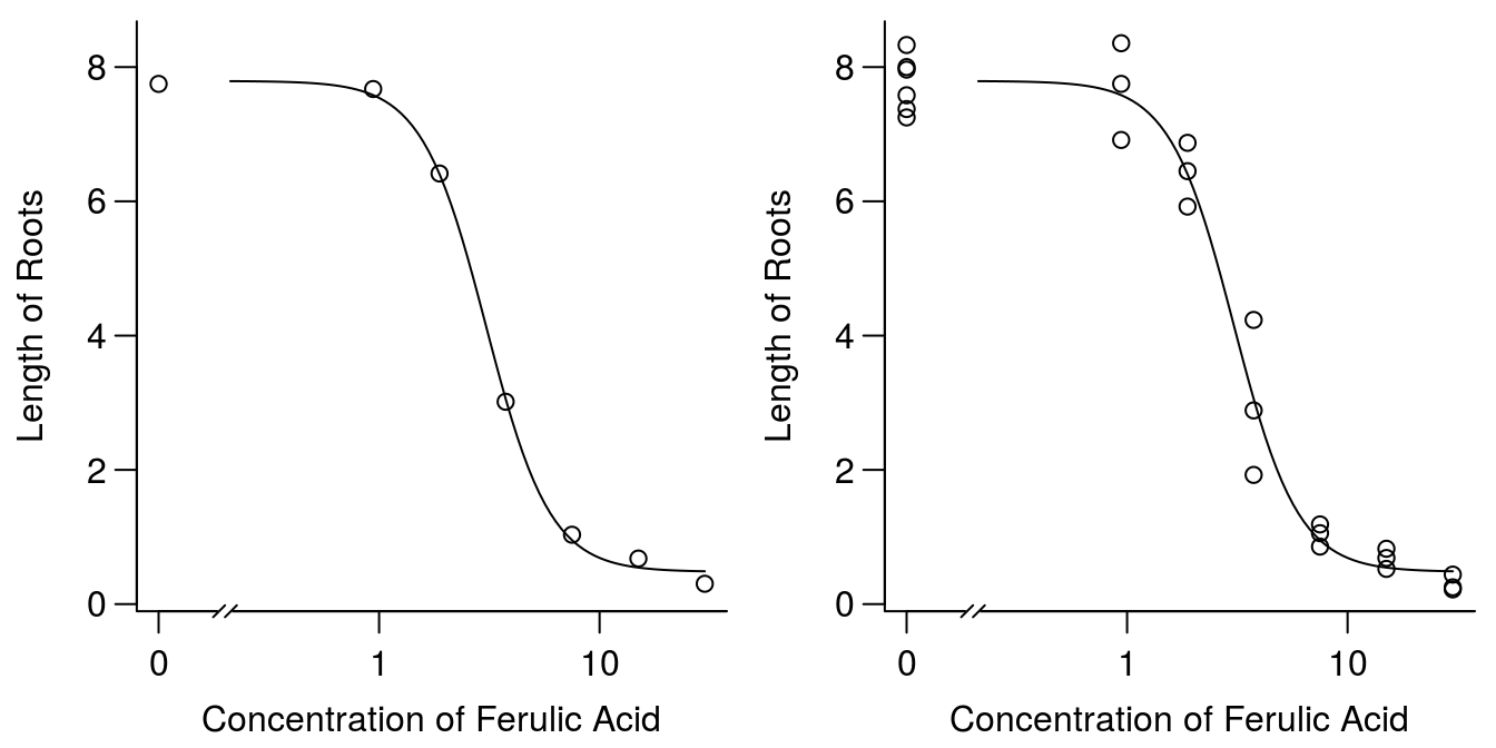
Figure 11.3: Plot of regression and averages of observations within each concentration (left), and all observation (right).
The slope of the dose-response curve at \(ED_{50}\) has the opposite sign as compared to the sign of the parameter b. This is the consequence of the parameterization used in drc for the log-logistic model, a choice that is in part rooted in what was commonly used in the past. The actual slope of the tangent of the curve at \(ED_{50}\) is determined :
\[\frac{-b}{(d-c)/(4*e)}\]
So apart from the sign there is a scaling factor that converts the parameter b into the slope, Therefore, the use of the word “relative”. Note that the scaling factor may be viewed as a kind of normalization factor involving the range of the response. As a consequence estimated b values often lie in the range 0.5 to 20 in absolute value, regardless of the assay or experiment generating the data.
Note at the end of the ryegrass help file ?ryegrass you can see examples, which give you some ideas of what can be done. The ryegrass help provides examples of various sigmoid curves to show the differences among them (see later). Note that we use the argument broken=TRUE to break the x-axis, because on a logarithmic scale, which is the default in drc, there is no such thing as a zero dose.
There are various ways to check if a regression model gives a satisfactory picture of the variation in data. Before doing further analysis, the best way to judge it is to look at the graph to see if there are some serious discrepancies between the regression and mean values. Being satisfied with the results of the fit, one way of checking is to test for lack of fit against the most general model, an ANOVA. It is done automatically in drc with the function modelFit().
#Test for lack of fit
modelFit(ryegrass.m1)
## Lack-of-fit test
##
## ModelDf RSS Df F value p value
## ANOVA 17 5.1799
## DRC model 20 5.4002 3 0.2411 0.8665Obviously, the test for lack of fit is non-significant and therefore we can tentatively entertain the idea that the regression analysis was just as good to describe the variation in data as was an ANOVA. The test for lack of fit is not enough to ensure the fit is reasonable, because of few degrees of freedom, in this instance only 3 degrees of freedom. Another issue is that the more doses we use the less likely it is that the test for lack of fit would become non-significant; the mere fact being that the log-logistic curve, like any other sigmoid curve, is just an approximation of the real relationship.
The distribution of the residuals and the hopefully normal distribution of residuals are informative to make sure that the prerequisites for doing a regression in the first place are not violated. The assumptions we must consider include:
- Correct regression model
- Variance Homogeneity
- Normally distributed measurement errors
- Mutually independent measurement error \(\varepsilon\)
Number 1 can always be discussed and we will not go too much into detail. This is generally determined by researchers familiar with the phenomena being described. Number 2 is important if you want to infer on the variability of parameters. Normally, the parameter estimates do not change much whether there are homogeneous variance or not; it is the standard errors that change and that is why we want to come so close to homogeneity of variance as possible. This is important when comparing curves, or evaluating the certainty we have about various parameters (like the effective dose or upper limit). Number 3 can be graphically shown and is only in some instances critical. Number 4 is important because we assume the observations for doses are independent of each other, a question that also can be debated. When we do dose-response experiments we often use the same stock solution. It means that any systematic error can be carried all the way though the dilution process and be part of the dose. Below we illustrate items 2 and item 3.
#Graphical analysis of residuals
op <- par(mfrow = c(1, 2), mar=c(3.2,3.2,2,.5), mgp=c(2,.7,0)) #put two graphs together
    plot(residuals(ryegrass.m1) ~ fitted(ryegrass.m1), main="Residuals vs Fitted")
abline(h=0)
qqnorm(residuals(ryegrass.m1))
 qqline(residuals(ryegrass.m1))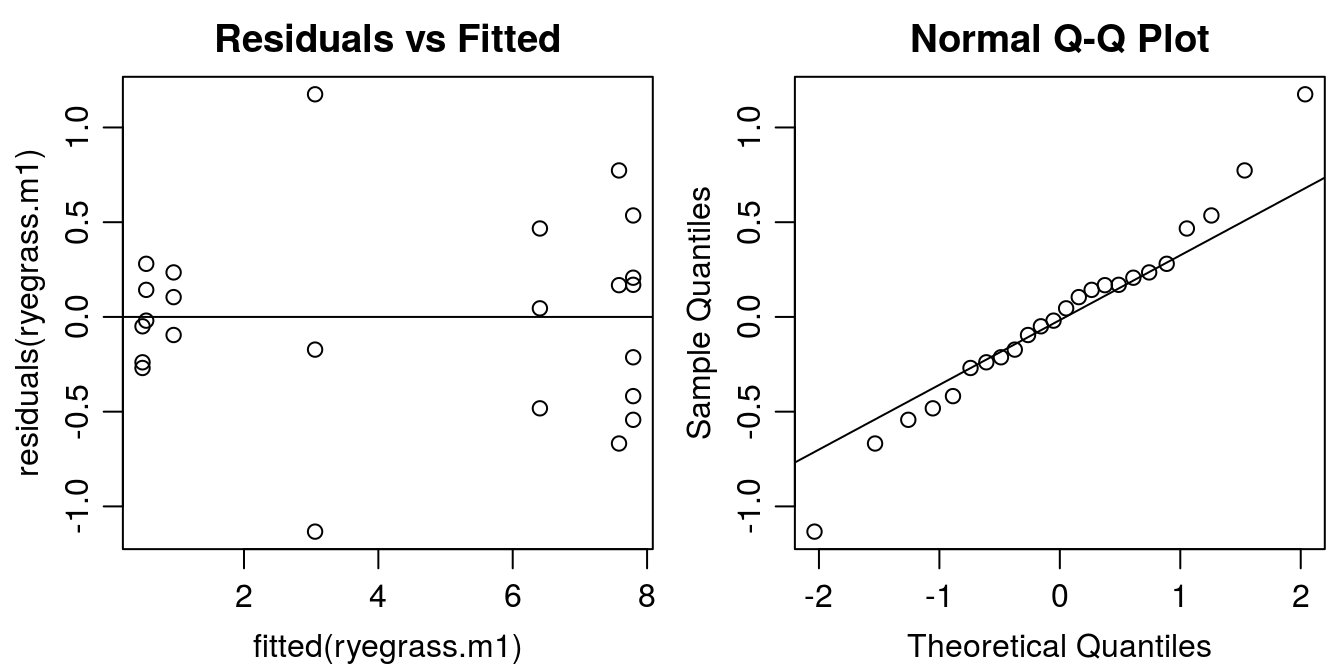
Figure 11.4: Model esiduals diagnostic plots: Left: distribution of residuals against the fitted value (variance homogeneity); Right: normal q-q plot illustrating whether the residuals are normally distributed (normally distributed measurement errors).
The residual plot indicates that the model was able to catch the variation in data. The distribution of residuals should look like a shotgun shot on a wall. Apparently, there are some systematic violations in the residual plot, At small fitted values the residuals are close to zero than at high fitted values the variation is much more pronounced. This is called a funnel type pattern. We also see it in the graphs with the fit and all the observations (Figure 11.4). The normal Q-Q plot looks all right, no serious deviation from the assumption of normal distribution of residuals. Later we will look at this problem, which is a statistical problem not a biological one.
11.2 Note on use of \(R^2\)
One of the most popular ways of assessing goodness of fit in regression, be it linear or nonlinear, is to use \(R^2\). The higher the better, but the \(R^2\) does not tell you how well the curve fits to the data. In fact, if there are large differences between the maximum and the minimum observation, the \(R^2\) will be larger than if the differences are small. It is also important to note that the most common interpretation of \(R^2\) for linear regression does not hold true for nonlinear regression; in the nonlinear case, the \(R^2\) value is not the amount of variability in Y explained by X. At its core, the \(R^2\) is a comparison of 2 models; in linear regression the two models being compared are the regression model and a null model indicating no relationship between X and Y. For nonlinear regression, the choice of a ‘null’ model is not as simple, and therefore the \(R^2\) type measure will be different depending on the chosen reduced model. The appropriate ‘null’ model may differ (and perhaps should differ) depending on the nonlinear model being used. Therefore, the \(R^2\) is not part of the output from drc. To give an example we fit a linear model to the ryegrass data.
op <- par(mfrow = c(1, 2), mar=c(3.2,3.2,0,.5), mgp=c(2,.7,0)) #put two graphs together
plot(rootl ~ conc, data = ryegrass, bty="l")
linear.m1 <- lm(rootl ~ conc, data = ryegrass)
summary(linear.m1)
##
## Call:
## lm(formula = rootl ~ conc, data = ryegrass)
##
## Residuals:
## Min 1Q Median 3Q Max
## -3.4399 -1.7055 0.9623 1.7532 2.3575
##
## Coefficients:
## Estimate Std. Error t value Pr(>|t|)
## (Intercept) 6.24176 0.52973 11.783 5.64e-11 ***
## conc -0.25929 0.04326 -5.994 4.94e-06 ***
## ---
## Signif. codes: 0 '***' 0.001 '**' 0.01 '*' 0.05 '.' 0.1 ' ' 1
##
## Residual standard error: 2.07 on 22 degrees of freedom
## Multiple R-squared: 0.6202, Adjusted R-squared: 0.603
## F-statistic: 35.93 on 1 and 22 DF, p-value: 4.939e-06abline(linear.m1)
plot(linear.m1, which=1, bty="l")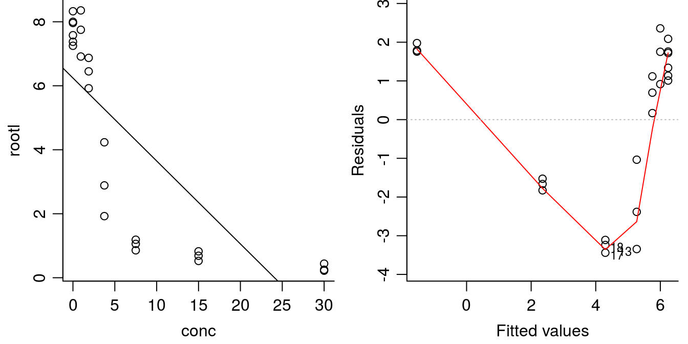
Figure 11.5: Linear regression y=-.25x+6.24 with highly significant parameters (left) and residual plot (right). The \(R^2\) is not negligable (\(R^2\) = 0.6), but the model is obviously not correct.
The regression parameters are highly significantly different from zero so it looks good as does \(R^2\) of 0.62 . This is not a small value, but obviously the goodness of fit is not good, let alone the systematic distribution of residuals. When trying to determine whether the nonlinear model is better or worse than the linear model, Akaike Information Criterion (AIC) can be used. Smaller values of AIC indicate better fit to the data.
AIC(ryegrass.m1, linear.m1)## df AIC
## ryegrass.m1 5 42.31029
## linear.m1 3 106.95109The AIC value for the nonlinear model ryegrass.m1 is much lower than the linear fit linear.m1 that definitely violated item 1. This confirms that the nonlinear model is a better fit to the data compared with the linear model.
11.3 Which Dose-Response Model?
There exists numerous sigmoid curves of which the log-logistic is the most common one. It is symmetric and the \(ED_{50}\) is a parameter of the model. Several other models exist, particularly, the non symmetric ones where \(ED_{50}\) is not a “natural” parameter. For example the Weibull-1 model.
\[y = c+(d-c)exp(-exp(b(log(x)-log(e)))) .\]
The parameter b is the steepness of the curve and the parameter e is the dose where the inflection point of the dose- response curve is located, which is not the \(ED_{50}\).The Weibull-1 descends slowly from the upper limit d and approach the lower limit c rapidly.
Another model, Weibull-2 is somewhat different from Weibull-1, because it has a different asymmetry, with a rapid descent from the upper limit d and a slow approach toward the lower limit (Figure 11.6).
\[y = c+(d-c)(1-exp(-exp(b(log(x)-log(e))))) .\]
Ritz 2009 has in detailed described those asymmetric dose-response curves and also illustrated it as shown in Figure 11.6.
library(drc)
## Comparing log-logistic and Weibull models
## (Figure 2 in Ritz (2009))
ryegrass.m0 <- drm(rootl ~ conc, data = ryegrass, fct = LL.4())
ryegrass.m1 <- drm(rootl ~ conc, data = ryegrass, fct = W1.4())
ryegrass.m2 <- drm(rootl ~ conc, data = ryegrass, fct = W2.4())

par(mfrow=c(1,1), mar=c(3.2,3.2,.5,.5), mgp=c(2,.7,0))
plot(ryegrass.m0, broken=TRUE, xlab="Dose (mM)", ylab="Root length (cm)", lwd=2,
     cex=1.2, cex.axis=1.2, cex.lab=1.2, bty="l")
plot(ryegrass.m1, add=TRUE, broken=TRUE, lty=2, lwd=2)
plot(ryegrass.m2, add=TRUE, broken=TRUE, lty=3, lwd=2)

arrows(3, 7.5, 1.4, 7.5, 0.15, lwd=2)
text(3,7.5, "Weibull-2", pos=4, cex=1.2)

arrows(2.5, 0.9, 5.7, 0.9, 0.15, lwd=2)
text(3,0.9, "Weibull-1", pos=2, cex=1.2)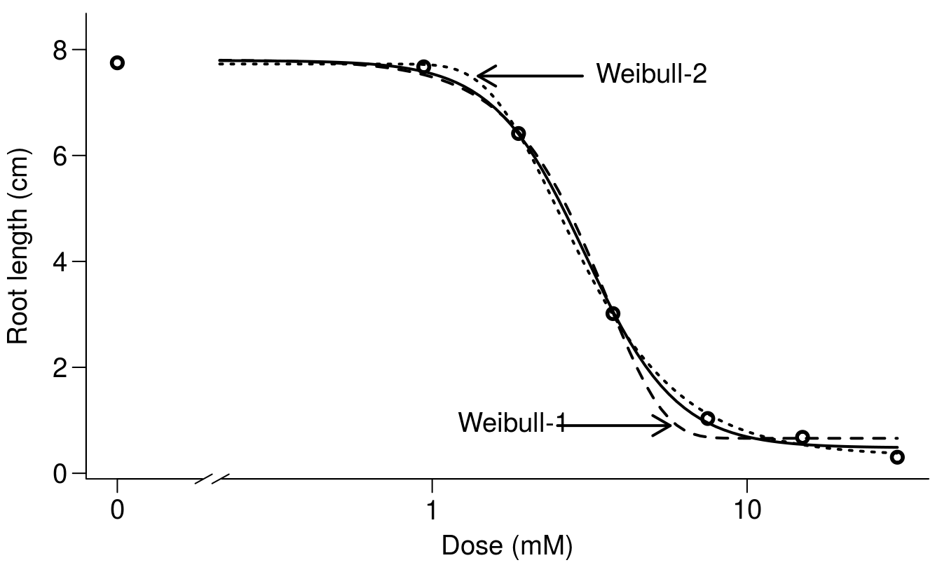
Figure 11.6: Comparison among the two asymmetric Weibull models and the log-logistic model. The differences in this instance are at either the upper limit or the lower limit of the curves.
The \(ED_{50}\) for the Weibull-1 and Weibull-2 model has to be derived from the fit by using the functionED().
ED(ryegrass.m1,50,interval="delta")##
## Estimated effective doses
##
## Estimate Std. Error Lower Upper
## e:1:50 3.08896 0.17331 2.72744 3.45048A relevant questions would be how do the \(ED_{x}\) change when fitting the different sigmoid curves?
To illustrate this we use the ggplot2 package and a function to combine graphs. First we have to calculate the \(ED_{x}\) and combine the results in a data.frame as done below.
edLL<-data.frame(ED(ryegrass.m0,c(10,50,90),interval="delta",
                    display=FALSE),ll="Log-logistic")
edW1<-data.frame(ED(ryegrass.m1,c(10,50,90),interval="delta",
                    display=FALSE),ll="Weibull 1")
edW2<-data.frame(ED(ryegrass.m2,c(10,50,90),interval="delta",
                    display=FALSE),ll="Weibull 2")
CombED<-rbind(edLL,edW1,edW2)
Then we can use plot_grid() from the cowplot package, which is a function that combines various independent ggplots into one plot.
library(ggplot2)
library(cowplot)

p1 <- ggplot(data=CombED[c(1,4,7),], aes(x=ll, y=Estimate))+
 geom_bar(stat="identity", fill="lightgreen", colour="black")+
  geom_errorbar(aes(ymin=Lower, ymax=Upper), width=0.1) +
  ylab("ED10")+
  xlab("")
p2 <- ggplot(data=CombED[c(2,5,8),], aes(x=ll, y=Estimate))+
  geom_bar(stat="identity", fill="lightgreen", colour="black")+
  geom_errorbar(aes(ymin=Lower, ymax=Upper), width=0.1) +
  ylab("ED50")+
  xlab("")

p3 <- ggplot(data=CombED[c(3,6,9),], aes(x=ll, y=Estimate))+
geom_bar(stat="identity", fill="lightgreen", colour="black")+
  geom_errorbar(aes(ymin=Lower, ymax=Upper), width=0.1) +
  ylab("ED90")+
  xlab("Sigmoid four parameter models")

plot_grid(p1,p2,p3, ncol=1)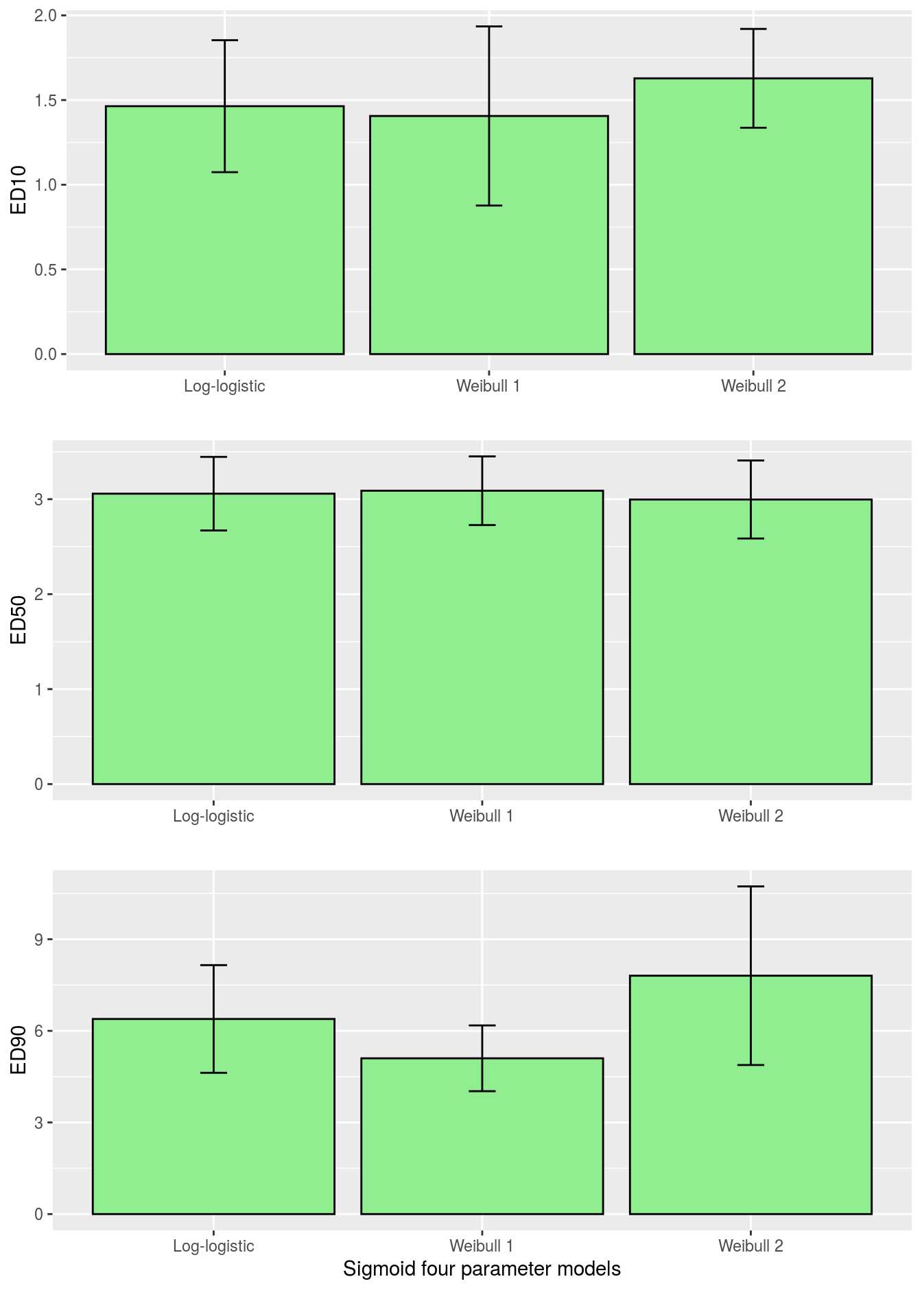
Figure 11.7: Comparison of \(ED_{10}\), \(ED_{50}\) and \(ED_{90}\) for various sigmoid dose-response curves with associated 95% confidence intervals.
Obviously, the ED-levels in Figure 11.7 in this instance did not change much among the three sigmoid curves. Sometimes they do and residual plots show that one of the asymmetrical curves is more appropriate than the common log-logistic, although it can not be substantiated by an ordinary test for lack of fit.drcalso has a function where you can test the differences between the \(ED_{x}\) as shown below
comped(CombED[c(1,4),1],CombED[c(1,4),2],log=F,operator = "-")##
## Estimated difference of effective doses
##
## Estimate Std. Error Lower Upper
## [1,] 0.057726 0.314927 -0.559519 0.675comped(CombED[c(1,7),1],CombED[c(1,7),2],log=F,operator = "-")##
## Estimated difference of effective doses
##
## Estimate Std. Error Lower Upper
## [1,] -0.16457 0.23335 -0.62193 0.2928comped(CombED[c(3,6),1],CombED[c(3,6),2],log=F,operator = "-")##
## Estimated difference of effective doses
##
## Estimate Std. Error Lower Upper
## [1,] 1.28762 0.99032 -0.65337 3.2286comped(CombED[c(6,9),1],CombED[c(6,9),2],log=F,operator = "-")##
## Estimated difference of effective doses
##
## Estimate Std. Error Lower Upper
## [1,] -2.7048 1.4939 -5.6327 0.2231comped(CombED[c(3,9),1],CombED[c(3,9),2],log=F,operator = "-")##
## Estimated difference of effective doses
##
## Estimate Std. Error Lower Upper
## [1,] -1.4172 1.6368 -4.6253 1.791comped(CombED[c(6,9),1],CombED[c(6,9),2],log=F,operator = "-")##
## Estimated difference of effective doses
##
## Estimate Std. Error Lower Upper
## [1,] -2.7048 1.4939 -5.6327 0.2231None of the differences are significantly different form zero, lower limits are negative in all instance and upper limits of the differences are positive.
11.4 More Dose-Response Curves
When it comes to assessment of herbicide selectivity, one dose-response curve does not tell you anything. Selectivity of a herbicide is always dose-dependent and a bioassay with a pre-fixed harvest day only gives a snapshot of the effect of a herbicide. When comparing dose-response curves of say two herbicides on the same plant species or one herbicide on two plant species, it is imperative that the curves you compare were run at the same point in time or at least close to and at the same stage of plant development. The training data set S.alba in the drc package consists of two dose-response curves, one for bentazon and one for glyphosate.
head(S.alba,n=2)## Dose Herbicide DryMatter
## 1 0 Glyphosate 4.7
## 2 0 Glyphosate 4.6tail(S.alba,n=2)## Dose Herbicide DryMatter
## 67 640 Bentazone 0.6
## 68 640 Bentazone 0.8## Fitting a log-logistic model with
S.alba.m1 <- drm(DryMatter ~ Dose, Herbicide, data=S.alba, fct = LL.4())Note that the the variable, Herbicide, identifies the herbicides, Therefore, the third argument in the drm() is the classification variable Herbicide.
modelFit(S.alba.m1)## Lack-of-fit test
##
## ModelDf RSS Df F value p value
## ANOVA 53 8.0800
## DRC model 60 8.3479 7 0.2511 0.9696summary(S.alba.m1)##
## Model fitted: Log-logistic (ED50 as parameter) (4 parms)
##
## Parameter estimates:
##
## Estimate Std. Error t-value p-value
## b:Glyphosate 2.715409 0.748279 3.6289 0.0005897 ***
## b:Bentazone 5.134810 1.130949 4.5403 2.760e-05 ***
## c:Glyphosate 0.891238 0.194703 4.5774 2.421e-05 ***
## c:Bentazone 0.681845 0.095111 7.1689 1.288e-09 ***
## d:Glyphosate 3.875759 0.107463 36.0661 < 2.2e-16 ***
## d:Bentazone 3.805791 0.110341 34.4911 < 2.2e-16 ***
## e:Glyphosate 62.087606 6.611444 9.3909 2.184e-13 ***
## e:Bentazone 29.268444 2.237090 13.0833 < 2.2e-16 ***
## ---
## Signif. codes: 0 '***' 0.001 '**' 0.01 '*' 0.05 '.' 0.1 ' ' 1
##
## Residual standard error:
##
## 0.3730047 (60 degrees of freedom)The test for lack of fit shows non-significance, and furthermore, the summary shows that the upper limits ds are very close to each other and the same applies to the lower limit cs. Consequently, we could entertain the idea that they are similar for both curves. We use the argument in the drm() function pmodels=data.frame(..)to make the upper limit and the lower limit similar for both curves. The argument follows the alphabetical order of the names of the parameters, b,c,d,e. Below, we will allow the b parameter to vary freely between the two herbicides, whereas c and d will be held the same for both herbicides (they have the same identification 1,1). Finally the e parameters can vary freely.
##  common lower and upper limits
S.alba.m2 <- drm(DryMatter ~ Dose, Herbicide, data=S.alba, fct = LL.4(),
                 pmodels=data.frame(Herbicide, 1, 1, Herbicide))
summary(S.alba.m2)
##
## Model fitted: Log-logistic (ED50 as parameter) (4 parms)
##
## Parameter estimates:
##
## Estimate Std. Error t-value p-value
## b:Bentazone 5.046141 1.040135 4.8514 8.616e-06 ***
## b:Glyphosate 2.390218 0.495959 4.8194 9.684e-06 ***
## c:(Intercept) 0.716559 0.089245 8.0291 3.523e-11 ***
## d:(Intercept) 3.854861 0.076255 50.5519 < 2.2e-16 ***
## e:Bentazone 28.632355 2.038098 14.0486 < 2.2e-16 ***
## e:Glyphosate 66.890545 5.968819 11.2067 < 2.2e-16 ***
## ---
## Signif. codes: 0 '***' 0.001 '**' 0.01 '*' 0.05 '.' 0.1 ' ' 1
##
## Residual standard error:
##
## 0.3705151 (62 degrees of freedom)par(mfrow=c(1,1), mar=c(3.2,3.2,.5,.5), mgp=c(2,.7,0))
plot(S.alba.m1, broken=TRUE, bty="l")
plot(S.alba.m2, col="red", broken=TRUE, add=TRUE, legend=FALSE)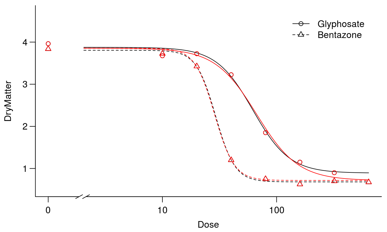
Figure 11.8: The two fits, one without assuming common upper and lower limits for the two curves (black) and one where the curves have the same upper and lower limits (red).
anova(S.alba.m1, S.alba.m2) # Test for lack of fit not signifiancant##
## 1st model
## fct: LL.4()
## pmodels: Herbicide, 1, 1, Herbicide
## 2nd model
## fct: LL.4()
## pmodels: Herbicide (for all parameters)## ANOVA table
##
## ModelDf RSS Df F value p value
## 2nd model 62 8.5114
## 1st model 60 8.3479 2 0.5876 0.5588A test for lack of fit was non-significant and, therefore, we presume that the curves have similar upper an lower limits. Now we have the ideal framework for comparing the relative potency between the two herbicides with similar upper and lower limit, we have the same reference for both curves.
Comparing the fit without freely estimated upper and lower limit and with common upper and lower limit did not change the \(ED_{50}\) much but did reduce the standard errors somewhat.
The next step could be to assume that the two curves also have the same slope, i.e. the two curves are similar and only differ in their relative displacement along the x-axis.
##  common lower and upper limits and slope
S.alba.m3 <- drm(DryMatter~Dose, Herbicide, data=S.alba, fct = LL.4(),
                 pmodels=data.frame(1, 1, 1, Herbicide))
anova(S.alba.m2, S.alba.m3)
##
## 1st model
## fct: LL.4()
## pmodels: 1, 1, 1, Herbicide
## 2nd model
## fct: LL.4()
## pmodels: Herbicide, 1, 1, Herbicide## ANOVA table
##
## ModelDf RSS Df F value p value
## 2nd model 63 9.4946
## 1st model 62 8.5114 1 7.1614 0.0095Although the ‘parallel’ curves in Figure 11.9 seem reasonable, the test for lack of fit now is significant, so the assumption of similar curves except for the \(ED_{50}\) is not supported. We should prefer, instead, the model with independent slopes (Figure 11.8).
par(mfrow=c(1,1), mar=c(3.2,3.2,.5,.5), mgp=c(2,.7,0))
plot(S.alba.m3, broken=TRUE, bty="l")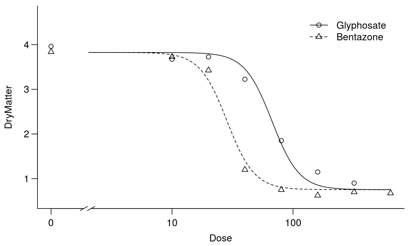
Figure 11.9: The two curves are similar except for their relative displacement on the x-axis - this is often called a parallel slopes model.
Comparing Figures 11.8 and 11.9 shows that the fits are forced so they do not capture the responses properly at the lower limits. As seen below the relative potency with common upper and lower limit but different slopes yield different relative potencies: \(ED_{10}\), \(ED_{50}\), and \(ED_{90}\).
#EDcomp(S.alba.LL.4.1, c(10, 50, 50), interval = "delta")
EDcomp(S.alba.m2, c(10, 10), interval="delta", reverse=TRUE)
##
## Estimated ratios of effect doses
##
## Estimate Lower Upper
## Glyphosate/Bentazone:10/10 1.44007 0.81836 2.06177EDcomp(S.alba.m2, c(50, 50), interval="delta", reverse=TRUE)##
## Estimated ratios of effect doses
##
## Estimate Lower Upper
## Glyphosate/Bentazone:50/50 2.3362 1.8571 2.8153EDcomp(S.alba.m2, c(90, 90), interval="delta", reverse=TRUE)##
## Estimated ratios of effect doses
##
## Estimate Lower Upper
## Glyphosate/Bentazone:90/90 3.7899 2.0793 5.5006It is noted above that the relative potency varies depending of the ED-level. This is of course due to the fact that the two curves have different slopes, b parameters. From a biological point of view the herbicides have different mode of action and experience shows that contact PS II herbicides, such as bentazon, would have a steeper slope than does the EPSP inhibitor, glyphosate.
In drc there is a function relpot() that can illustrate the relationship between changes of the relative potency and the predicted responses.
par(mfrow=c(1,1), mar=c(3.2,3.2,.5,.5), mgp=c(2,.7,0))
relpot(S.alba.m2, interval = "delta", bty="l")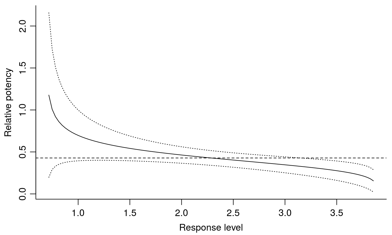
Figure 11.10: The relative potency varies depending of response level, with the 95% confidence intervals. The dashed horizontal line shows the relative potency at the \(ED_{50}\) for glyphosate and bentazon.
The most precise ED-level is at the \(ED_{50}\); towards the extremes close to the upper and lower limit the variation becomes huge. This is a general trend and explains why we often wish to quantify toxicity of a compound by using \(ED_{50}\).
11.5 When Upper and Lower Limits are not similar
In real life, e.g., when testing herbicide tolerant/resistant biotypes of weeds and different weed species, we cannot expect that the upper and lower limits are similar among curves and that the curves have the same slopes. On the contrary, if there is a penalty for acquiring resistance (fitness cost) then the untreated control for each biotype would be expected to have different biomass. Depending on the time from spraying and ambient growth condition at harvest; the lower limit may also differ.
Whatever the purpose of assessing potencies among plants the problem of different upper and lower limits is often “solved” in the literature by scaling the raw data to percentage of untreated control. This “solution” often results in smaller but incorrect standard error of \(ED_{50}\) being inflated by the scaling.
In general, we do not want to go for low standard error, but go for the correct standard error. Therefore, we recommend to do all the curve-fitting on original raw data!
Below we have two accessions of Echonichlora oryzoides where both the upper limit and the lower limits are different.
op <- par(mfrow = c(1, 1), mar=c(3.2,3.2,.5,.5), mgp=c(2,.7,0))
TwoCurves<-read.csv("http://rstats4ag.org/data/twoCurves.csv")
head(TwoCurves,3)
## xn Dose Accesion Dry.weight.per.pot X
## 1 33 0 SAM-E-8 1.968 NA
## 2 34 0 SAM-E-8 2.030 NA
## 3 35 0 SAM-E-8 2.129 NABispyribac.sodium.m1 <- drm(Dry.weight.per.pot ~ Dose, Accesion,
data = TwoCurves, fct=LL.4())
modelFit(Bispyribac.sodium.m1)## Lack-of-fit test
##
## ModelDf RSS Df F value p value
## ANOVA 48 1.7678
## DRC model 56 2.2799 8 1.7384 0.1137summary(Bispyribac.sodium.m1)##
## Model fitted: Log-logistic (ED50 as parameter) (4 parms)
##
## Parameter estimates:
##
## Estimate Std. Error t-value p-value
## b:SAM-E-8 2.047171 0.327585 6.2493 5.957e-08 ***
## b:TEK-E-10 0.876716 0.315014 2.7831 0.007327 **
## c:SAM-E-8 0.245913 0.073938 3.3259 0.001560 **
## c:TEK-E-10 -0.053077 0.091626 -0.5793 0.564726
## d:SAM-E-8 2.242014 0.081575 27.4841 < 2.2e-16 ***
## d:TEK-E-10 1.827553 0.101102 18.0764 < 2.2e-16 ***
## e:SAM-E-8 21.702693 2.276642 9.5328 2.514e-13 ***
## e:TEK-E-10 2.666463 1.026905 2.5966 0.012004 *
## ---
## Signif. codes: 0 '***' 0.001 '**' 0.01 '*' 0.05 '.' 0.1 ' ' 1
##
## Residual standard error:
##
## 0.2017751 (56 degrees of freedom)plot(Bispyribac.sodium.m1, broken=TRUE, bp=.1, ylab="Dry Matter(g/pot)",
xlab="Bispyribac sodium (g/ha)", bty="l")
# drawing lines on the plot
ED.SAM.E.8 <- 0.24591 + (2.24201 - 0.24591) * 0.5
ED.TEK.E.10 <- -0.05308 + (1.82755 +- 0.05308) * 0.5
arrows(0.1, ED.SAM.E.8, 21.7, ED.SAM.E.8, code=0)
arrows(21.7, ED.SAM.E.8, 21.7, 0, code=0)
arrows(0.1, ED.TEK.E.10, 2.67, ED.TEK.E.10, code=0, lty=2)
arrows(2.67, ED.TEK.E.10, 2.67, 0, code=0, lty=2)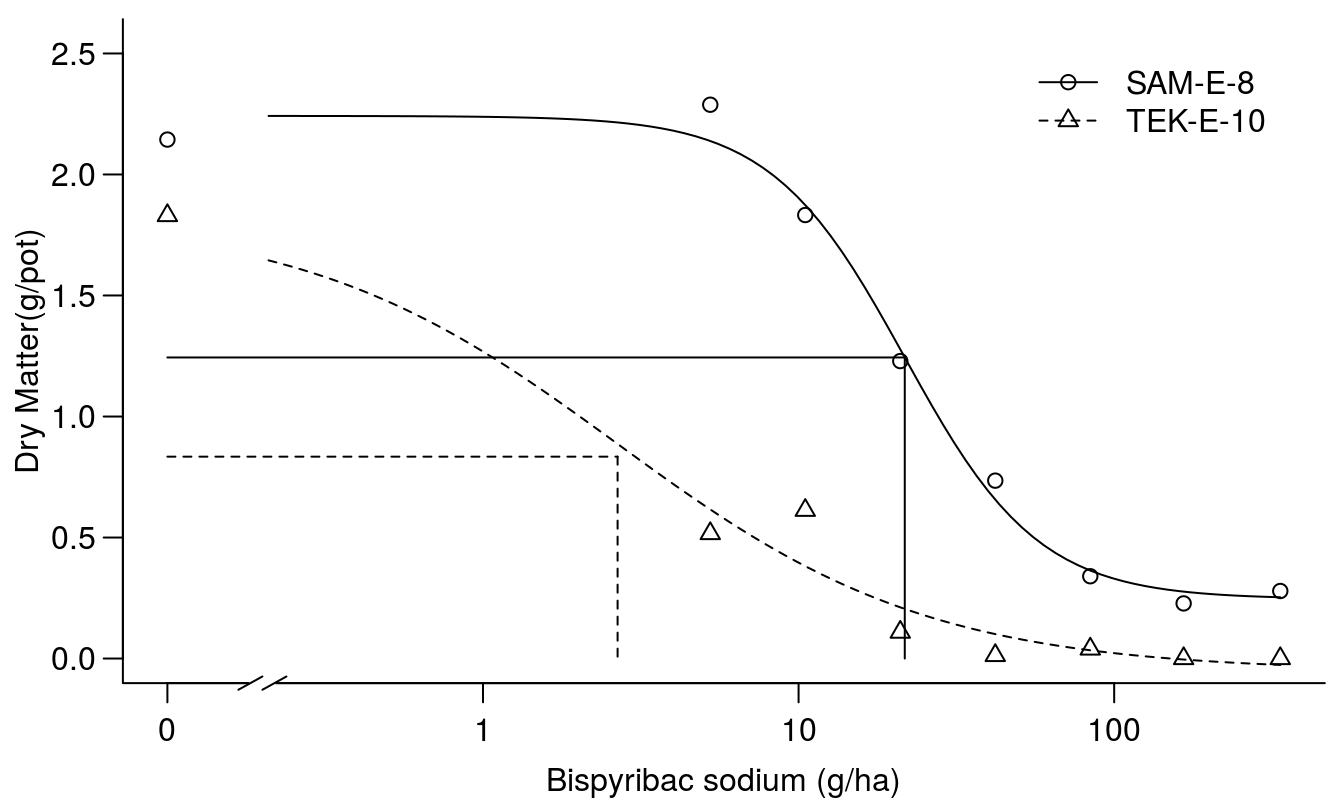
Figure 11.11: Fit of regression for two accessions.
The fit looks reasonable and the test for lack of fit is non-significant and the \(ED_{50}\)s are shown. Everything seems to be all right, but we notice that distribution of observations for TEK-E-10 could be better to describe the mid range of the responses. The summary above reveals that the lower limit, c, for TEK-E-10 is less than zero, not much and not different from zero though, but still illogical. We can re-fit the model using the lowerl= argument which will allow us to restrict model parameters to biologically relevant estimates. In this case, we will restrict the lower limit to values of zero or greater. All other parameters will still be allowed to vary without restriction.
Bispyribac.sodium.m2 <- drm(Dry.weight.per.pot ~ Dose, Accesion,
                            data = TwoCurves, fct=LL.4(),
                            lowerl=c(NA,0,NA,NA))
summary(Bispyribac.sodium.m2)
##
## Model fitted: Log-logistic (ED50 as parameter) (4 parms)
##
## Parameter estimates:
##
## Estimate Std. Error t-value p-value
## b:SAM-E-8 2.042454 0.329052 6.2071 6.984e-08 ***
## b:TEK-E-10 1.015226 0.313919 3.2340 0.002049 **
## c:SAM-E-8 0.243411 0.074596 3.2631 0.001881 **
## c:TEK-E-10 0.000000 0.071617 0.0000 1.000000
## d:SAM-E-8 2.242077 0.082057 27.3234 < 2.2e-16 ***
## d:TEK-E-10 1.826855 0.101703 17.9627 < 2.2e-16 ***
## e:SAM-E-8 21.740911 2.295727 9.4702 3.166e-13 ***
## e:TEK-E-10 2.730186 0.961385 2.8398 0.006280 **
## ---
## Signif. codes: 0 '***' 0.001 '**' 0.01 '*' 0.05 '.' 0.1 ' ' 1
##
## Residual standard error:
##
## 0.2028892 (56 degrees of freedom)We see that the standard error dropped and now we will use the fit and calculate the selectivity factor at \(ED_{50}\):
EDcomp(Bispyribac.sodium.m2, c(50, 50),interval="delta")##
## Estimated ratios of effect doses
##
## Estimate Lower Upper
## SAM-E-8/TEK-E-10:50/50 7.9632 2.0988 13.8275The resistance factor is about 8 and significantly greater than 1. Note this is one of the few times we do not test the null hypothesis but the hypothesis, that the potency is the same for the two accessions; that is, the relative potency is 1.0. Another important issue is that the dry matter for the \(ED_{50}\) differs because of the different upper and lower limits. This will not be solved by scaling the observation to the individual accessions’ untreated control.
Obviously, the \(ED_{50}\) is not at the same response level, and the relative potency of 8 is significantly different form 1.00.
When using absolute dry matter of say 1.24, the response at \(ED_{50}\) for SAM-E-8 and TEK-E-10 is seen below.
ED(Bispyribac.sodium.m2, 1.24, type="absolute", interval="delta")##
## Estimated effective doses
##
## Estimate Std. Error Lower Upper
## e:SAM-E-8:1.24 21.799437 2.302921 17.186132 26.412741
## e:TEK-E-10:1.24 1.306694 0.698047 -0.091663 2.705051Looking at the distribution of observation for TEK-E-10, there are no observations to determine the shape of the curve above the \(ED_{50}\).
If this is the right way to compare absolute response level we could use \(ED_{1.24}\) (Figure 11.12).
par(mfrow = c(1, 1), mar=c(3.2,3.2,.5,.5), mgp=c(2,.7,0))
plot(Bispyribac.sodium.m2, broken=TRUE, bp=.1, bty="l",
     ylab="g Dry Matter/pot",
     xlab="Dose (g Bispyribac sodium/ha)")
arrows(  0.1, 1.24, 21.79, 1.24, code=0, lty=1, col="red")
arrows(21.79, 1.24, 21.79,    0, code=0, lty=1, col="red")
arrows(  1.31, 1.24,   1.31,    0, code=0, lty=2, col="red")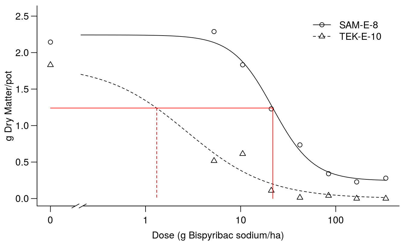
Figure 11.12: Comparison of the two dose-response curves; red vertical lines show the dose of bispyribac sodium resulting in 1.24 g of dry matter (horizontal line) for the two biotypes.
Now the resistance factor below becomes huge, but so does the confidence interval and consequently the resistance factor is not statistically different from 1.0 at an alpha ov 0.05. The villain is the poor precision of TEK-E-10 \(ED_{1.24}\) that is not significantly different form 0.0.
EDcomp(Bispyribac.sodium.m2, c(1.24, 1.24), type="absolute",interval="delta")##
## Estimated ratios of effect doses
##
## Estimate Lower Upper
## SAM-E-8/TEK-E-10:1.24/1.24 16.683 -1.516 34.882The problems described above is virtually never mentioned in the weed science journals, even though it is instrumental to understand what we actually compare. The researcher must choose, and the choice has nothing to do with statistics but with biology.
On the basis of the fit above we can actually scale data on the basis of the regression parameters of the d and the c parameters.
SAM.E.8.C<-coef(Bispyribac.sodium.m1)[3]
TEK.E.10.C<-coef(Bispyribac.sodium.m1)[4]
SAM.E.8.d<-coef(Bispyribac.sodium.m1)[5]
TEK.E.10.d<-coef(Bispyribac.sodium.m1)[6]

Rel.Y<-with(TwoCurves,
            ifelse(Accesion=="SAM-E-8",
                   ((Dry.weight.per.pot-SAM.E.8.C)/(SAM.E.8.d-SAM.E.8.C)),
                   ((Dry.weight.per.pot-TEK.E.10.C)/(TEK.E.10.d-TEK.E.10.C))))

Scaled.m1<-drm(Rel.Y ~ Dose, Accesion, pmodels=data.frame(Accesion, 1, Accesion),
        data=TwoCurves, fct=LL.3())
par(mfrow = c(1, 1), mar=c(3.2,3.2,.5,.5), mgp=c(2,.7,0))
plot(Scaled.m1, broken=TRUE, bp=.1, bty="l",
     ylab="Relative Dry Matter", ylim=c(0,1.2),
     xlab="Bispyribac-sodium dose (g/ha)")
arrows(  0.1, .5, 21.7,.5, code=0, lty=1, col="red")
arrows(21.79, 0.5, 21.79,    0, code=0, lty=1, col="red")
arrows(  2.66, .5,   2.66,    0, code=0, lty=2, col="red")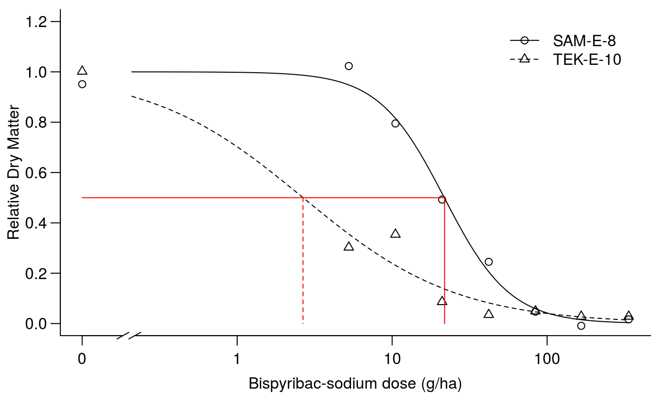
Figure 11.13: Regression fit of scaled responses with similar upper limit, d, and lower limit set to zero.
The summary of the fit in Figure 11.13 shows that we get almost the same parameters for the scaled \(ED_{50}\)’s and the selectivity factor is the same but what is concealed by fitting the scaled responses is that the dry matter production is not the same for the two curves, because the scales are originally different. In essence, scaling the data in this way removes the valuable information contained in the d parameter without adding benefit.
summary(Scaled.m1)##
## Model fitted: Log-logistic (ED50 as parameter) with lower limit at 0 (3 parms)
##
## Parameter estimates:
##
## Estimate Std. Error t-value p-value
## b:SAM-E-8 2.048548 0.264669 7.7400 1.507e-10 ***
## b:TEK-E-10 0.875897 0.197672 4.4311 4.133e-05 ***
## d:(Intercept) 0.999972 0.031495 31.7504 < 2.2e-16 ***
## e:SAM-E-8 21.697160 1.825621 11.8848 < 2.2e-16 ***
## e:TEK-E-10 2.662759 0.924541 2.8801 0.005533 **
## ---
## Signif. codes: 0 '***' 0.001 '**' 0.01 '*' 0.05 '.' 0.1 ' ' 1
##
## Residual standard error:
##
## 0.1005159 (59 degrees of freedom)EDcomp(Scaled.m1, c(50, 50),interval="delta")##
## Estimated ratios of effect doses
##
## Estimate Lower Upper
## SAM-E-8/TEK-E-10:50/50 8.1484 2.4492 13.8475In summary, fitting on raw data the relative potency is 7.96 (2.93) with a coefficient of variation of 37% with the fit on scaled data on the basis of the upper limits of the regression fit on raw data the relative potency also is 8.14 (2.84) with a coefficient of variation of 32%. In this instance not dramatically different, except that for the raw data the relative potency is significantly different from zero on the 2% level whereas for the fit on relative data it is significant on the 1% level. However, if we go for an absolute ED at the dry matter of 1.24 the the relative potency is 16, but not significantly different from zero. In the literature the differences between untreated controls among accessions can be much larger than here.
11.6 Remedy for heterogeneous variance
Turning back to the ryegrass dataset the plot of the fit with all observations and the residual plot suggest we should do some kind of transformation or weighing. Because the log-logistic relationship is on the original scale, we cannot just make a transformation of response without doing the same on the right hand side of the equation. drc has a function that can do a a BoxCox transform-both-side regression. You can get more information by executing ?boxcox.drc.
- Fit the original model
- update the fit with the function boxcox()
par(mfrow = c(1, 1), mar=c(3.2,3.2,.5,.5), mgp=c(2,.7,0))
ryegrass.BX <- boxcox(ryegrass.m1,method="anova")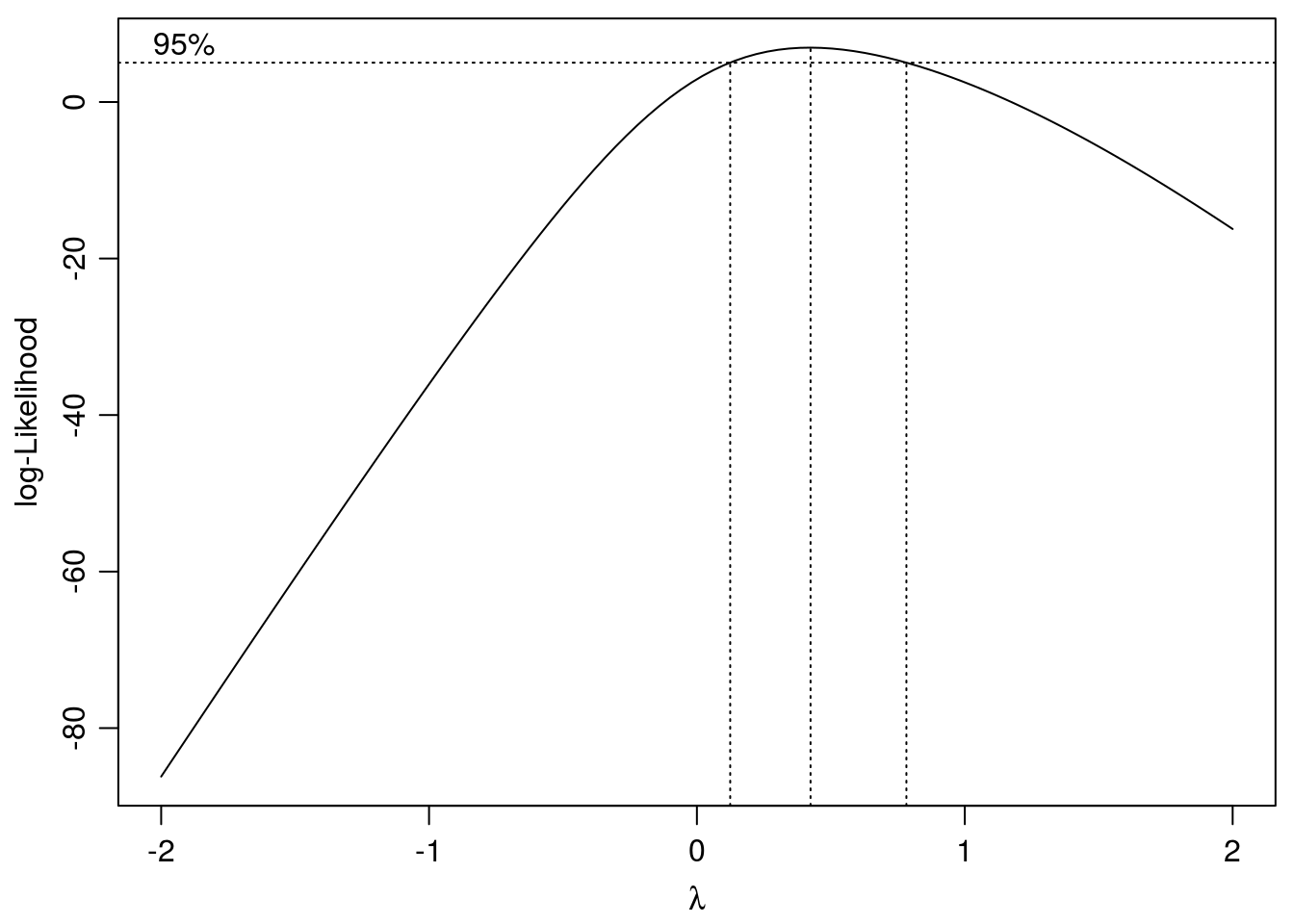
Figure 11.14: Search for optimum \(\lambda\) with confidence intervals. The chosen \(\lambda\) is 0.42.
The summary below give the parameters with the BoxCox transformation.
summary(ryegrass.BX)##
## Model fitted: Weibull (type 1) (4 parms)
##
## Parameter estimates:
##
## Estimate Std. Error t-value p-value
## b:(Intercept) 1.573865 0.223277 7.0489 7.772e-07 ***
## c:(Intercept) 0.476866 0.090536 5.2672 3.731e-05 ***
## d:(Intercept) 8.007031 0.393446 20.3510 7.759e-15 ***
## e:(Intercept) 3.845926 0.308134 12.4813 6.764e-11 ***
## ---
## Signif. codes: 0 '***' 0.001 '**' 0.01 '*' 0.05 '.' 0.1 ' ' 1
##
## Residual standard error:
##
## 0.3258055 (20 degrees of freedom)
##
## Non-normality/heterogeneity adjustment through Box-Cox transformation
##
## Estimated lambda: 0.424
## Confidence interval for lambda: [0.124,0.782]ED(ryegrass.BX,50,interval="delta")##
## Estimated effective doses
##
## Estimate Std. Error Lower Upper
## e:1:50 3.04695 0.29106 2.43981 3.65409The changes in parameters and their standard deviations in relation to the original fit are not dramatic. Normally, if the heterogeneity of variance is moderate and the response curve is well described by responses covering the response range, the changes in the parameters would be small, but perhaps there will be changes in the standard errors. Consequently, if the objective is to compare potency among compounds the prerequisite for constant variance may be important to draw the optimal conclusions.
The residuals after the BoxCox update look a bit better now, compared to the original one.
#Graphical analysis of residuals
op <- par(mfrow = c(1, 2), mar=c(3.2,3.2,2,.5), mgp=c(2,.7,0)) #put two graphs together
    plot(residuals(ryegrass.BX) ~ fitted(ryegrass.BX), main="Residuals vs Fitted")
abline(h=0)
qqnorm(residuals(ryegrass.BX))
 qqline(residuals(ryegrass.BX))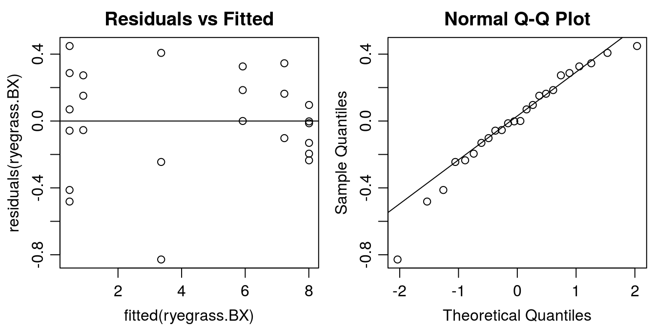
Figure 11.15: Residual plots of BoxCox transformed-both-sides.The funnel type distribution of the residuals now has disappeared.
11.7 Dose-responses with binomial data
Survival of plant or ability to germinate in response to herbicides is a classical underlying construct in toxicology. In weed science it also is important because the only good weed is a dead weed. Particularly, in these ages of detecting herbicide resistance/tolerance the dead or alive response is important. In insecticide research and in general toxicology the binomial response, dead or alive or affected not affected is fundamental for classifying toxic compounds.
A prerequisite is that we know how to properly classify the demise of a plant. We are far away from the normal distribution. The data, however, can still be analysed with the function drm() but a new argument must be included in the drm() function, viz type="binomial.
11.7.1 Example 1: Herbicide susceptibility
Below we have an experiment with putative glyphosate sensitive and tolerant biotypes of Chenopodium album and the survival as response, which takes two values: 0 means dead and 1 means alive. In fact, every plants is an experimental unit. We assume that all plants survived in the untreated control and at infinite high rates all plants die. It is important to note, though, that this assumption may not always hold; for example, some triazine-resistant biotypes may not be killed by atrazine, even at exceptionally high doses. But for this example, the data suggest that even the tolerant biotype can be killed at high doses.
library(drc)
read.csv("http://rstats4ag.org/data/chealglyph.csv")->cheal.dat
head(cheal.dat,n=3)
## block biotype glyph.rate survival
## 1 A S 426 0
## 2 A T 1680 0
## 3 A T 0 1drm(survival ~ glyph.rate, biotype, fct=LL.2(names=c("Slope", "LD50")),
type=("binomial"), data=cheal.dat, na.action=na.omit)->cheal.drm
par(mfrow = c(1, 1), mar=c(3.2,3.2,.5,.5), mgp=c(2,.7,0))
plot(cheal.drm, broken=TRUE, xlim=c(0,10000), bty="l",
xlab="glyphosate rate", ylab="P(survival)")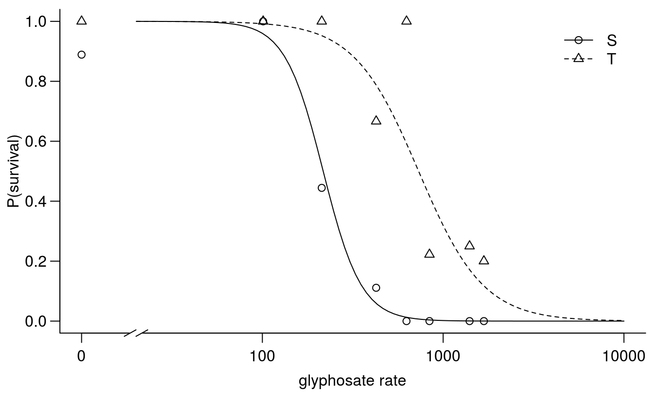
Figure 11.16: Dose-response curves for survival of Chenopodium album classified a priori as either sensitive or tolerant to glyphosate based on field history.
modelFit(cheal.drm)## Goodness-of-fit test
##
## Df Chisq value p value
##
## DRC model 89 63.247 0.9823summary(cheal.drm)##
## Model fitted: Log-logistic (ED50 as parameter) with lower limit at 0 and upper limit at 1 (2 parms)
##
## Parameter estimates:
##
## Estimate Std. Error t-value p-value
## Slope:S 4.10418 1.40025 2.9310 0.0033783 **
## Slope:T 2.42592 0.72357 3.3527 0.0008003 ***
## LD50:S 216.98961 30.29692 7.1621 7.945e-13 ***
## LD50:T 731.56946 122.16134 5.9886 2.117e-09 ***
## ---
## Signif. codes: 0 '***' 0.001 '**' 0.01 '*' 0.05 '.' 0.1 ' ' 1The data from the tolerant biotypes are not as ‘clean’ as for the sensitive biotype, and this is reflected in the standard error of the \(LD_{50}\). This variability is often to be expected when a population is still segregating for a resistance trait, and individual organisms are being used as experimental units. The ?EDcomp()` function can be used to test whether the \(LD_{50}\) is statistically different between biotypes.
EDcomp(cheal.drm,c(50,50), reverse=TRUE)##
## Estimated ratios of effect doses
##
## Estimate Std. Error t-value p-value
## T/S:50/50 3.3714492 0.7338531 3.2315040 0.0012314The two biotypes exhibit an approximately 3-fold difference in susceptibility to glyphosate, and this difference is statistically different from 1.
Another important issue here, is that the response range goes between 0 to 1.0, which is in contrast to the use of continuous response variables such as biomass. Generally, you get more information using biomass or other continuous responses, but also more difficult choices for interpretation, as mentioned before about, e.g. how to deal with different upper limit and lower limits among dose response curves.
11.7.2 Example 2: Earthworm toxicity
The next example is from an ecotoxicological experiment with earthworms. A number of earthworms is distributed uniformly in a container where one half of the container surface is contaminated by a toxic substance (not disclosed). If the earthworms do not like the substance they will flee to the uncontaminated part of the container.
In this dataset the arrangement for data is somewhat different from the one with the sensitive and tolerant Chenopodium album. For each container we have a dose, a total number of earthworms, and the number of earthworms that migrated away form the contaminated part of the container. Consequently, we now need to use an additional argument in drm(), a weighing argument weights=total.
head(earthworms,n=3)## dose number total
## 1 0 3 5
## 2 0 3 5
## 3 0 3 4## Fitting a logistic regression model
earthworms.m1 <- drm(number/total ~ dose, weights = total, data = earthworms,
fct = LL.2(), type = "binomial")
modelFit(earthworms.m1) # a crude goodness-of-fit test## Goodness-of-fit test
##
## Df Chisq value p value
##
## DRC model 28 35.236 0.1631summary(earthworms.m1)##
## Model fitted: Log-logistic (ED50 as parameter) with lower limit at 0 and upper limit at 1 (2 parms)
##
## Parameter estimates:
##
## Estimate Std. Error t-value p-value
## b:(Intercept) 1.260321 0.246707 5.1086 3.246e-07 ***
## e:(Intercept) 0.145140 0.036797 3.9444 8.000e-05 ***
## ---
## Signif. codes: 0 '***' 0.001 '**' 0.01 '*' 0.05 '.' 0.1 ' ' 1par(mfrow = c(1, 1), mar=c(3.2,3.2,.5,.5), mgp=c(2,.7,0))
plot(earthworms.m1, broken=TRUE, bty="l")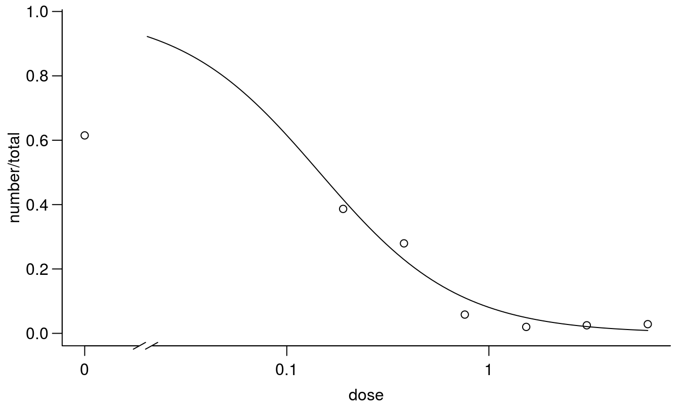
Figure 11.17: Standard 2 parameter log-logistic dose-response regression with upper and lower limits set to 1 and 0, respectively.
The regression above is a standard the with an upper limit of 1 and apparently the goodness of fit is not significant, even though the untreated control is around 0.6. From a biological point of view the earthworms can move freely after half of the container is contaminated with toxic materials. In the untreated control with no contamination we expect that around 0.5 would be present in the part where we count. Therefore, a 2-parameter model with the upper limit fixed at 1.0 does not seem appropriate here. Consequently, we will introduce a three parameter log-logistic model with an upper limit being estimated on the basis of data.
## Fitting an extended logistic regression model
##  where the upper limit is estimated
earthworms.m2 <- drm(number/total ~ dose, weights = total, data = earthworms,
                     fct = LL.3(), type = "binomial")
modelFit(earthworms.m2)  # goodness-of-fit test
## Goodness-of-fit test
##
## Df Chisq value p value
##
## DRC model 32 43.13 0.0905summary(earthworms.m2)##
## Model fitted: Log-logistic (ED50 as parameter) with lower limit at 0 (3 parms)
##
## Parameter estimates:
##
## Estimate Std. Error t-value p-value
## b:(Intercept) 1.505679 0.338992 4.4416 8.928e-06 ***
## d:(Intercept) 0.604929 0.085800 7.0505 1.783e-12 ***
## e:(Intercept) 0.292428 0.083895 3.4856 0.000491 ***
## ---
## Signif. codes: 0 '***' 0.001 '**' 0.01 '*' 0.05 '.' 0.1 ' ' 1par(mfrow = c(1, 1), mar=c(3.2,3.2,.5,.5), mgp=c(2,.7,0))
plot(earthworms.m2, broken=TRUE, bty="l")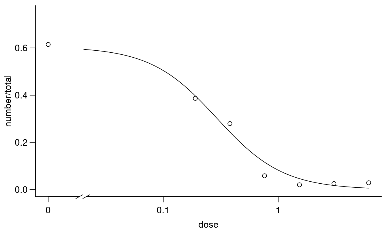
Figure 11.18: Regression fit with the upper limit being estimated instead of fixed at 1.0.
The goodness of fit was also here acceptable, so on the basis of the statistics we cannot pick the “best model”. However, we could compare the AIC for the two models and pick the lowest value.
AIC(earthworms.m1, earthworms.m2)## df AIC
## earthworms.m1 2 699.10026
## earthworms.m2 3 78.31036The model with the estimated upper limit has an AIC that is 9 times smaller than the 2-parameter model. This also corresponds with what we biologically expected.
The \(LD_{50}\) changed somewhat because the upper limit changed, not because there is much difference of the mid part of the curves as snow below.
par(mfrow = c(1, 1), mar=c(3.2,3.2,.5,.5), mgp=c(2,.7,0))
plot(earthworms.m1, broken=TRUE,  col="red", lty=2, bty="l")
plot(earthworms.m2, broken=TRUE, add=TRUE)
legend("topright",c("2-parameter model (d = 1)", "3-parameter model (d = estimated)"),
       lty=2:1, col=c("red",1))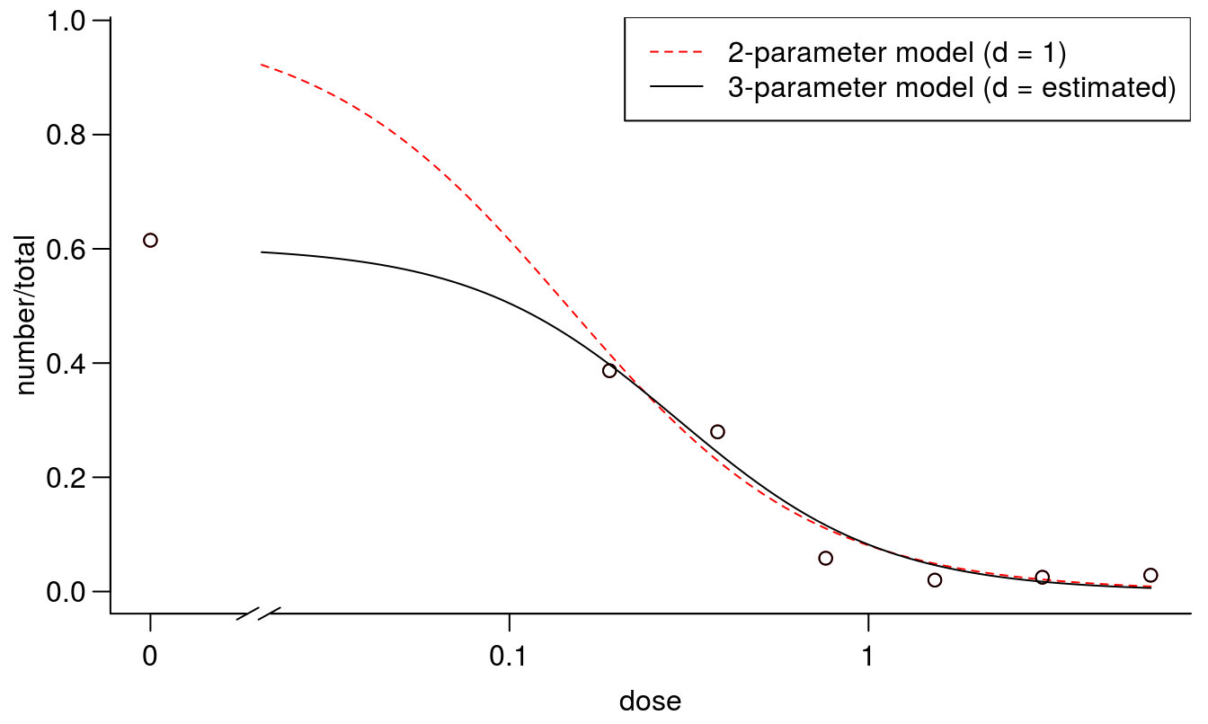
Figure 11.19: Comparison between the two curves fittings on with standard d=1 and one with a d determined by data.
The earthworm example is a good one, because the biological knowledge of the set up of the experiment is instrumental to understanding which model to use. In fact the \(LD_{50}\) ranged from 0.04 with the 2 parameter log-logistic fit to 0.29 while the 3 parameter log-logistic fit, which was the correct one from a biological point of view. We do expect that the earthworms would evenly distribute themselves in the untreated control with about 50% in each part of the box.