13 Plant Competition Experiments
Competition experiments are a staple of weed science. Typically, we often want to assess the effect of weed density or duration of competition on crop yield. There is an ongoing debate about the appropriateness of using density and not for example plant cover. We will not go into this debate, but stick to density of plant, because the methods of analyzing data remain the same whether the independent variable, x, is density or plant cover.
One of the important questions is,how do we assess competition and when does it start. In principle competition starts at germination and is a question of the resources:
- Light
- Nutrients
- Water
- “Space”
The three first factors are rather easy to quantify, but the fourth one is more intangible it is dependent on the growth habits of the weeds, e.g. prostrate, erect and the ability of the crop to outgrow the weeds. Whatever the reason for competition, it often boils down to the relationship in Figure 13.1; when will the relationship divert from a straight line.
13.1 Yield, Density and Yield Loss
The general plant competition and crop yield loss relationships are consider the same, a rectangular hyperbola. In Figure 13.1 we have a classical intra-specific competition relationship (A), and a yield loss relationship (B). Competition materializes when the curve diverts from the straight line. The initial straight line means that putting a new plant into the system just increases the yield the same way as all the other individuals contribute initially. When individual plants begin compete with each other for resources, because of high density, then the curves diverts from the straight line.
In Figure 13.1B, the percentage yield loss is based upon the yield without the presence of weeds. The competition (inter-specific competition) for resources materializes itself immediately. When the line diverts from the straight line relationship there will also be some intra-specific competition among the weeds. If there is no competition between crop and weeds at all, then the slope of the curve in Figure 13.1B would be zero, or no change in yield whatever the density of weeds.
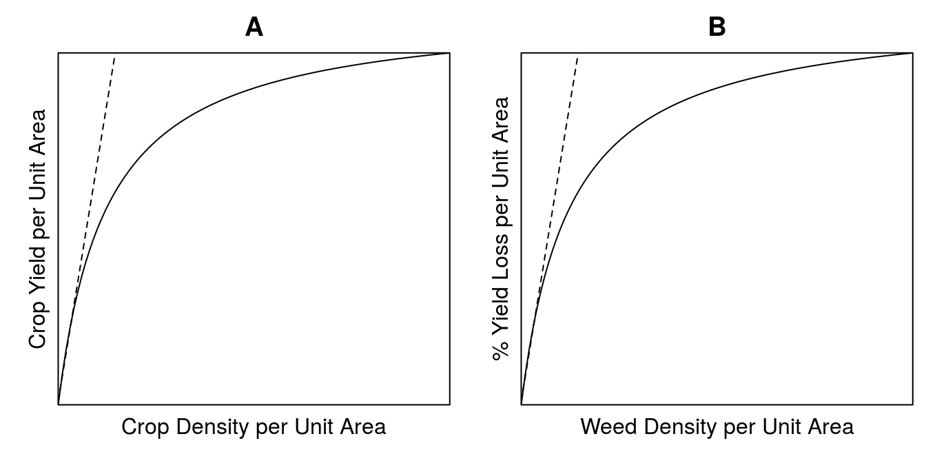
Figure 13.1: Competition within the same species, often denoted intra-specific competition (A). Yield loss function based on the percentage yield loss relative to the yield in weed free environment (B).
If the yield is a crop and the density is weeds per unit area then the the competition (inter-specific competition) materializes in exactly the same way. But now the competition begins from the very start. If there is no competition between crop and weed then the slope of the curve would be zero, viz no change in yield whatever the density of weeds.
The first example is a study conducted near Lingle, Wyoming over two years. In this study, volunteer corn densities ranging from 0 to 2.4 plants/\(m^2\) were planted along with dry edible beans to document the bean yield loss from increasing volunteer corn density.
read.csv("http://rstats4ag.org/data/volcorn.csv")->VolCorn
VolCorn$yr<-as.factor(VolCorn$yr)
VolCorn$reps<-as.factor(VolCorn$reps)

head(VolCorn,n=3)
## yr reps dens y.pct y.kg
## 1 2009 1 0 3.283996 6273
## 2 2009 2 0 9.466543 5872
## 3 2009 3 0 4.625347 6186The variable ‘yr’ is the year the study was completed (either 2008 or 2009), reps denotes the replicate (1 through 4), ‘dens’ is the volunteer corn density in plants/\(m^2\) (0 to 2.4), ‘y.pct’ is the percentage dry bean yield loss as compared with the zero volunteer corn density, and ‘y.kg’ is the dry bean yield in kg/ha.
Cousens 1985 proposed a re-parameterization of a rectangular hyperbola (perhaps better known as Michaelis-Menten) model as a tool to analyze competition experiments, and the drc is well suited for this type of analysis Ritz and Streibig 2005. This package must be loaded with the code:
library(drc)The drm() function can be used to fit a variety of non-linear models, including the Michaelis-Menten model. The code to fit the Michaelis-Menten model to the volunteer corn data is for one of the two years, 2009, by using the argument data=VolCorn, subset=yr==2009,
drm(y.pct ~ dens, fct=MM.2(names=c("Vmax","K")), data=VolCorn,
    subset=yr==2009, na.action=na.omit)->y2009.MM2
summary(y2009.MM2)
##
## Model fitted: Michaelis-Menten (2 parms)
##
## Parameter estimates:
##
## Estimate Std. Error t-value p-value
## Vmax:(Intercept) 66.7415 73.8753 0.9034 0.3782
## K:(Intercept) 2.6490 4.8209 0.5495 0.5894
##
## Residual standard error:
##
## 13.32239 (18 degrees of freedom)Obviously, the Vmax and K parameter of the Michaelis-Menten model were non-significant, the reason is that the range of density of weeds were not large enough, we only catch the linear part (Figure 13.2).
par(mfrow = c(1, 1), mar=c(3.2,3.2,.5,.5), mgp=c(2,.7,0))
plot(y2009.MM2,log="",
     ylab= "Percent Sugarbeet Yield Loss",
     xlab="Volunteer Corn Density",
     ylim=c(0,70), xlim=c(0,10), bty="l")
abline(h=66.7, lty=2)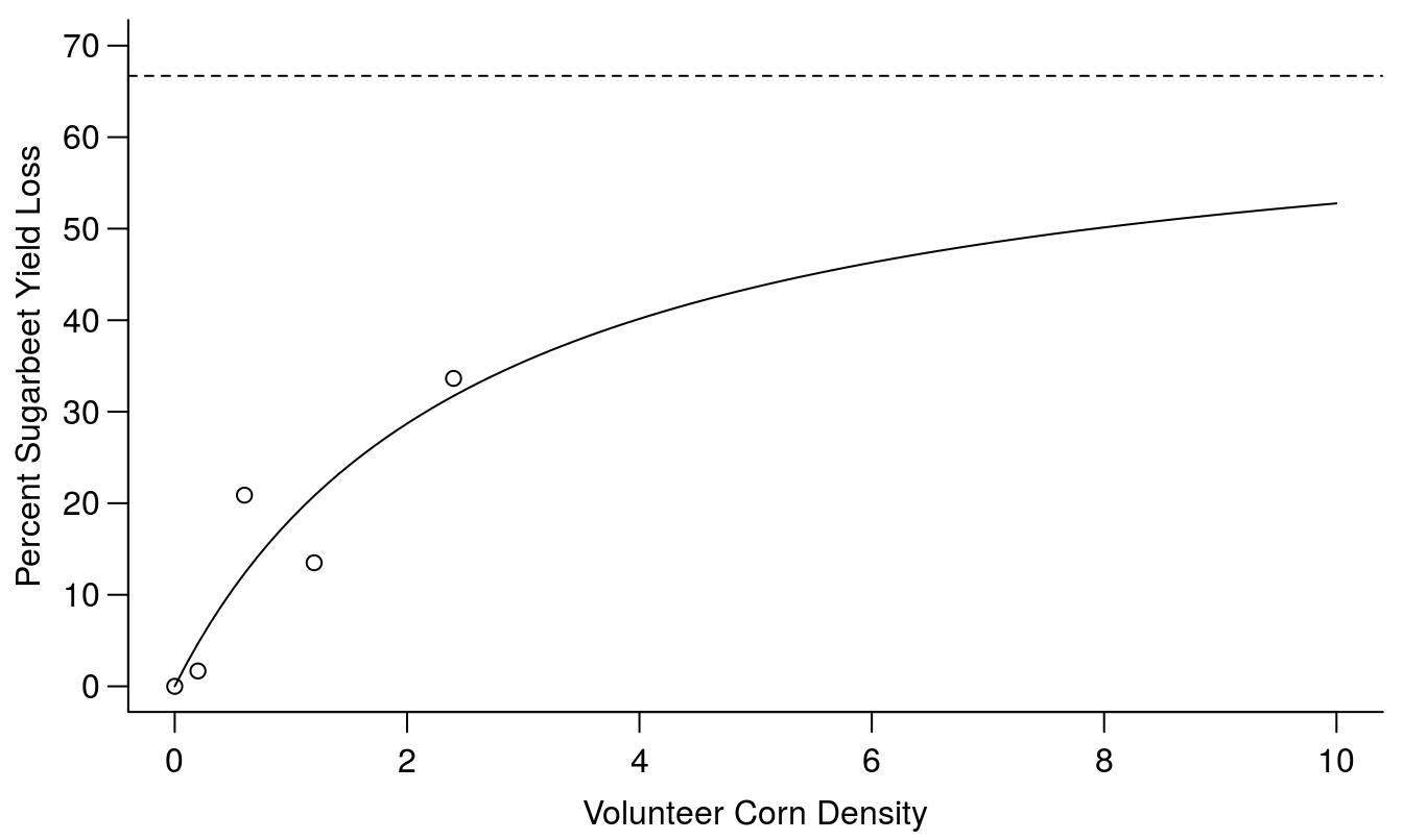
Figure 13.2: Yield loss curve with a two parameter Michaelis-Menten’s curve (the argument in drm() is fct=MM.2(). The Vmax is the upper limit, shown with the broken horizontal line, and k is the rate constant.
All functions in the drc package are defined in the getMeanFunctions() by writing ?MM.3 or ?MM.2 you can see the help on the curve fitting function.
\[y=c + \frac{d-c}{1+(e/x)} .\]
The suffix 3 or 2 defines how many asymptotes we use. The most common one is MM.2 where there is only one upper limit d, in this context often referred to as Vmax. If you compare the model above with the log-logistic models, used in the selectivity and dose-response chapter, they look almost identical except that b in the log-logistic does not exist in MM.2 or MM.3, because for this case b=1. The standard error of the parameter estimates reveals that none of the two parameters are significantly different from zero. This is due to the fact that only the first part of the curve is supported by experimental data as seen in Figure 13.2; there is no data to support the upper limit of the curve.
The tradition in weed science, as mentioned above, is to reparametrizise the Michaelis-Menten model and use:
\[Y_L = \frac{Ix}{1+Ix/A} .\]
which was proposed by Cousens (1985), where A now is the upper limit and I is the initial slope of the curve as shown Figure 13.1. This reparametrization is available in the ‘drc’ package by using the ‘yieldLoss()’ function as shown below:
yieldLoss(y2009.MM2, interval="as")##
## Estimated A parameters
##
## Estimate Std. Error Lower Upper
## 1 66.741 73.875 -88.465 221.948
##
##
## Estimated I parameters
##
## Estimate Std. Error Lower Upper
## 1 25.195 18.749 -14.196 64.585The upper limit, which is called Vmax in the Michaelis-Menten and A in the yieldLoss function is the same 67% and the rate constant in the Michaelis-Menten is 2.64 (corresponding to ED50 in the Log-logistic), but for the Cousens rectangular hyperbola the initial slope is 25. Of course the parameters of the yieldLoss() function were not different from zero either.
Looking at the yield loss curve one could suspect that a straight line relationship applies. We test the regression against the most general model an ANOVA:
lm.Y2009<-lm(y.pct ~ dens,data=VolCorn, subset=yr==2009)
ANOVA.Y2009<-lm(y.pct ~ factor(dens), data=VolCorn, subset=yr==2009)
anova(lm.Y2009,ANOVA.Y2009)
## Analysis of Variance Table
##
## Model 1: y.pct ~ dens
## Model 2: y.pct ~ factor(dens)
## Res.Df RSS Df Sum of Sq F Pr(>F)
## 1 18 3241.9
## 2 15 2637.2 3 604.71 1.1465 0.3625The test for lack of fit is non-significant (p=0.36) so we can confidently assume the straight line gives a good description of the relationship.
summary(lm.Y2009)##
## Call:
## lm(formula = y.pct ~ dens, data = VolCorn, subset = yr == 2009)
##
## Residuals:
## Min 1Q Median 3Q Max
## -30.013 -6.501 1.457 7.370 27.645
##
## Coefficients:
## Estimate Std. Error t value Pr(>|t|)
## (Intercept) 2.498 4.285 0.583 0.56717
## dens 13.002 3.475 3.741 0.00149 **
## ---
## Signif. codes: 0 '***' 0.001 '**' 0.01 '*' 0.05 '.' 0.1 ' ' 1
##
## Residual standard error: 13.42 on 18 degrees of freedom
## Multiple R-squared: 0.4374, Adjusted R-squared: 0.4062
## F-statistic: 14 on 1 and 18 DF, p-value: 0.001495Sugarbeet yield loss increases by 13% with each volunteer corn plant/m\(^2\) that is added into the system.
library(dplyr)
Yield.m<-subset(VolCorn,yr==2009) %>%
  group_by(dens) %>%
  summarise(Yieldloss=mean(y.pct))

par(mfrow = c(1, 1), mar=c(3.2,3.2,.5,.5), mgp=c(2,.7,0))
plot(Yieldloss ~ dens,data=Yield.m,
     ylab="Percent Sugarbeet Yield Loss",
     xlab="Volunteer corn density", bty="l")
abline(lm.Y2009)
plot(y2009.MM2,log="", add=T, lty=2)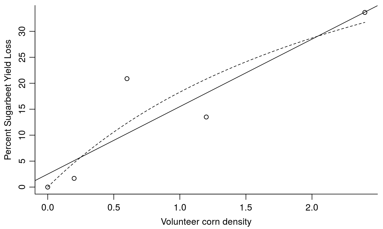
Figure 13.3: The linear model fit with a slope of 13 meaning that for every unit density of corn we get a yield decrease of 13%. The broken line is the nonlinear fit from shown in Figure 13.2.
The assumption of a straight line relationship in Figure 13.3 is justified by the test for lack of fit and we can conclude we loose 13% yield per each volunteer corn plant. However, it is important to recognize that the further we extrapolate beyond the volunteer corn densities used in the study, the more likely the linear fit is to provide nonsensical yield loss estimates.
One issue with expressing yield loss as a function of the weed-free is it relies heavily on the weed-free control treatments from a particular study. When regression is used, it is possible to use the density relationship (in addition to the weed-free control treatment) to provide a more robust estimate of crop yield in the absence of weed competition. The weed-free yield can be estimated by using the following re-parameterization of the rectangular hyperbolic model (also proposed by Cousens 1985):
\[Yield = Y_0(1-(\frac{Ix}{100(1+Ix/A)})) \]
where Y0 is the intercept with the yield axis when weed density is zero. Of course it requires that the curve is well described over the range of relevant weed densities Ritz, Kniss and Streibig 2015.
13.2 Replacement Series
The replacement series can assess interference, niche differentiation, resource utilization, and productivity in simple mixtures of two species. Of course more than two species can be used as long as the total density remains the same, but the interpretation of results becomes very difficult. The species are growing at the same total density, but the proportion between the two species vary. One of the good things about replacement series is that if the replacement graphs looks like the one in Figure 5, it could be the reference, because with linear relationships in Figure 5 shows no competition; the two species do not interfere with each others growth. As discuss earlier, when there is a straight line relationship between yield and density of a species ( Figure 1), the second species does not interfere. If there is a curved relationship there is intraspecific and/or inter specific competition. The intraspecific competition can only be assessed if a species is grown in pure stand.
The density dependence, maximum density determined by experimenter, impedes generalization for a replacement series. And as always, we only get a snapshot of what is going on in an otherwise dynamic competition scenario. In order to avoid criticisms, however, researchers should appreciate the assumptions and limitations of this methodology Jollife 2000
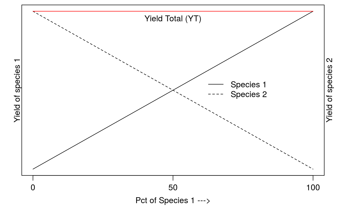
Figure 13.4: The frame of reference for replacement series with two species where there is no competition between species and the Yield Total (YT) does not change which ever the combination of the two species is. The two species do not need to have the same maximum yield in monoculture.
The philosophy of the replacement series is that the carrying capacity, in terms of say biomass, on a unit of land is constant whatever the proportion of the species.
The example uses a barley crop grown together with the weed Amsinckia menziesii. The experiment was run in greenhouse with the intention of having 20 plants in total in pots of 20 cm in diameter. After 20 days the plants were harvested and the actual number of plants were counted and the biomass per species measured.
The dataset Replacement series.csv is a mixture of csv and csv2 files, because the students who did the experiments came form continental Europe or Australia. It means the continental Europeans use the semicolon as variable separator mixed with the Australian’s decimal separator of dot. This mess is taken care of by using the read.table() function.
As we have to use the percent of either species as independent variable to fit regression models we have to define new variables Pct.Amsinckia and Pct.Barley.
Replace.1<-read.table("http://rstats4ag.org/data/ReplacementSeries.csv",
                      header=TRUE, sep=";", dec=".")
Replace.1$Pct.Amsinckia<-with(Replace.1,D.Amsinckia*100/(D.Amsinckia+D.Barley))
Replace.1$Pct.Barley<-   with(Replace.1,D.Barley*100/(D.Amsinckia+D.Barley))
head(Replace.1,n=3)
## D.Amsinckia D.Barley Harvest.time B.Amsinckia B.Barley Pct.Amsinckia Pct.Barley
## 1 0 14 14.05.2014 0 98.1 0 100
## 2 0 32 14.05.2014 0 112.7 0 100
## 3 0 21 14.05.2014 0 94.5 0 100First we try straight line relationships and illustrate the fit and with an analysis of residuals.
lm.Amsinckia<-lm(B.Amsinckia ~Pct.Amsinckia,data=Replace.1)
lm.Barley<-lm(B.Barley ~Pct.Barley,data=Replace.1)

par(mfrow = c(2, 2), mar=c(3.2,3.2,.5,.5), mgp=c(2,.7,.0))
plot(B.Amsinckia ~Pct.Amsinckia,data=Replace.1, ylab="Yield of Amsinckia",
     xlab="Percent of Amsinckia")
  legend("topleft", "A", bty="n")
abline(lm.Amsinckia)
plot(B.Barley ~Pct.Barley,data=Replace.1,ylab="Yield of Barley",
     xlab="Percent of Barley",pch=16)
  legend("topleft", "B", bty="n")
abline(lm.Barley,lty=2)
plot(lm.Amsinckia,which=1, caption=NA)
  legend("topleft", "C", bty="n")
plot(lm.Barley,which=1, caption=NA)
  legend("topleft", "D", bty="n")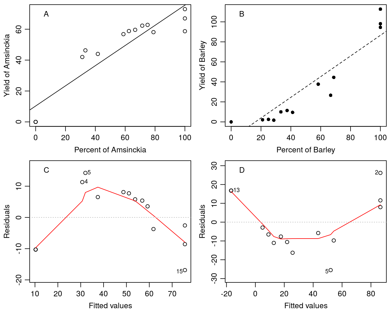
Figure 13.5: Straight line relationships do not appear to capture the variation in the species. The analysis of residuals shows systematic departure form the expected shotgun distribution of residuals.
Obviously, the relationships in Figure 13.5 for both species look like a curved relationship. We are not sure of which relationship to use and resort to a second degree polynomial.
\[Yield = a+bx+cx^2 .\]
where a is the intercept with the y-axis and b and c are parameters for the x and the x2. The biological meanings of polynomial parameters in general are not often of interest because they can be hard to interpret. To fit the polynomial we use the lm()function because it is essentially a linear model we are fitting by adding a parameter for the x2 by writing I(x^2). However, we cannot use the abline() function since there is now more than one ‘slope’ parameter.
To plot a line, first we generate predicted values using the polynomial model to get smooth fits. It is done with the predict()function predict(Pol.B.Amsinckia,data.frame(Pct.Amsinckia=seq(0,100,by=1))) where
Pol.B.Amsinckiathe results of the second degree polynomial fit for Amsinckiadata.frame(Pct.Amsinckia=seq(0,100,by=1))generates a sequence of ‘x’ values from 0 to 100 by 1 (for a total of 101 values).
The same procedure applies to barley.
Pol.B.Amsinckia<-lm(B.Amsinckia ~Pct.Amsinckia+I(Pct.Amsinckia^2),data=Replace.1)
line.Pol.B.Amsinckia<-predict(Pol.B.Amsinckia,data.frame(Pct.Amsinckia=seq(0,100,by=1)))

Pol.B.Barley<-lm(B.Barley ~Pct.Barley+I(Pct.Barley^2),data=Replace.1)
line.Pol.B.Barley<-predict(Pol.B.Barley,data.frame(Pct.Barley=seq(0,100,by=1)))

par(mfrow = c(1, 2), mar=c(3.2,3.2,.5,.5), mgp=c(2,.7,.0))
plot(B.Amsinckia ~Pct.Amsinckia,data=Replace.1,ylim=c(0,100), bty="l",
     ylab="Amsinckia yield", xlab="Percent Amsinckia")
lines(line.Pol.B.Amsinckia~seq(0,100,by=1),col="red")
plot(B.Barley ~Pct.Barley,data=Replace.1,pch=16,ylim=c(0,100), bty="l",
     ylab="Barley yield", xlab="Percent Barley")
lines(line.Pol.B.Barley~seq(0,100,by=1),col="red",lty=2)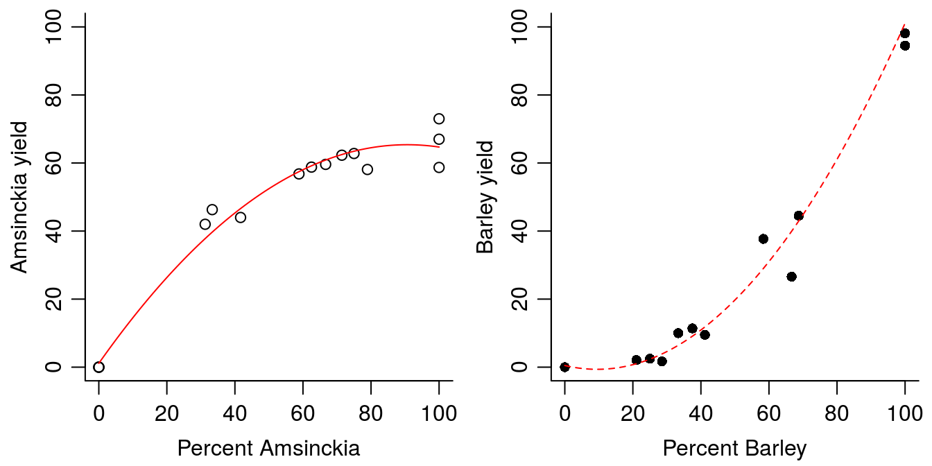
Figure 13.6: Fitting second degree polynomials to data.
Overall the second degree polynomials describe the variation reasonably well (Figure 13.6). However, there is a catch to it, the minimum for the Amsinckia second degree polynomial is at low percent of Amsinckia and the maximum for the second degree polynomial for barley is at rather high proportion of barley. If we can live with that we can use the fit to summarize the experiment by calculation the Yield Total (YT) as shown in the graph in Figure 13.4.
This is a good example of the problem with polynomials. A Second degree polynomial is symmetric with either a minimum or a maximum depending of the parameters. A third degree polynomial does not have this symmetric property, it becomes much more complex, and it is definitely not advisable to use with interpolations. In order to summarize the experiment on the basis of the fits, we can combine the two curves for the two species and calculate the YT.
We want to use the line.Pol.B.Amsinckia and the line.Pol.B.Barley that define the smooth lines and calculate YT. In order to calculate the YT we must sum the two predicted yields, but we must be carevul to reverse the order of one of the species (in this case we’ll reverse using the function rev(line.Pol.B.Barley). For this example, the maximum yield is 102, which occurs when the percentage of Amsinckia is 0% (found by using the which.max() function).
max(line.Pol.B.Amsinckia + rev(line.Pol.B.Barley))## [1] 102.2132which.max(line.Pol.B.Amsinckia + rev(line.Pol.B.Barley))-1## 1
## 0par(mfrow = c(1, 1), mar=c(5.2,3.2,0.5,.5), mgp=c(2,.7,.0))
plot(c(line.Pol.B.Amsinckia[101],line.Pol.B.Barley[101])~c(100,0),type="l",
ylim=c(0,120), xlab="", ylab="Yield", bty="l")
mtext("Amsinckia (%) --->",side=1,line=2)
mtext("<--- Barley (100-%)",side=1,line=3)
Pred.RYT<-line.Pol.B.Amsinckia[1:101]+line.Pol.B.Barley[seq(101,1,by=-1)]
lines(Pred.RYT~seq(0,100,by=1),lty=3,lwd=2)
lines(line.Pol.B.Barley~seq(100,0,by=-1),col="blue",lty=2)
lines(line.Pol.B.Amsinckia~seq(0,100,by=1),col="red",lty=1)
points(B.Amsinckia ~Pct.Amsinckia,data=Replace.1,pch=19,ylim=c(0,100), col="red")
points(B.Barley ~Pct.Amsinckia,data=Replace.1,pch=1,ylim=c(0,100), col="blue")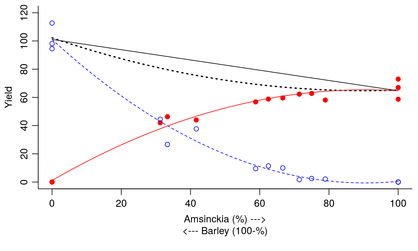
Figure 13.7: Summary of the replacement series experiment with barley and Amsinckia. Solid and dotted black lines represent theoretical linear and estimated actual YT, respectively; red solid line and filled circles represent Amsinckia yield; blue dashed line and open circles represent barley yield.
It seems in Figure 13.7 that if Amsinckia gains with its convex curve, and barley suffers with its concave curve, but gain and suffering still leave the YT below the theoretical value of YT.
Another issue is that that we do not test the regressions statistically, but use the fit to illustrate the relationships. In order to apply test statistics it requires more systematic designs with fixed number of plants per unit area, which unfortunately was not the case here. In the first example we had genuine replication with several replicates of the number of volunteer corn per unit area and therefore we could test which model could be used.
It also shows that when fitting curves we can derive predicted values, which can be used to calculate derived parameters such as YT. In replacement series analysis, one often scales the results so that the theoretical maximum yield is equal to 1.0 and then calculate the Relative yield Total (RYT), which in mixed cropping research is called Land Equivalent Ratio (LER).